Have you ever noticed how certain color combinations seem to work perfectly? That’s the magic of analogous colors. These neighboring hues on the color wheel create harmony that feels natural and pleasing to the eye.
Think sunset oranges melting into warm yellows. Or ocean blues flowing into deep teals. These color relationships aren’t accidents; they’re design goldmines.
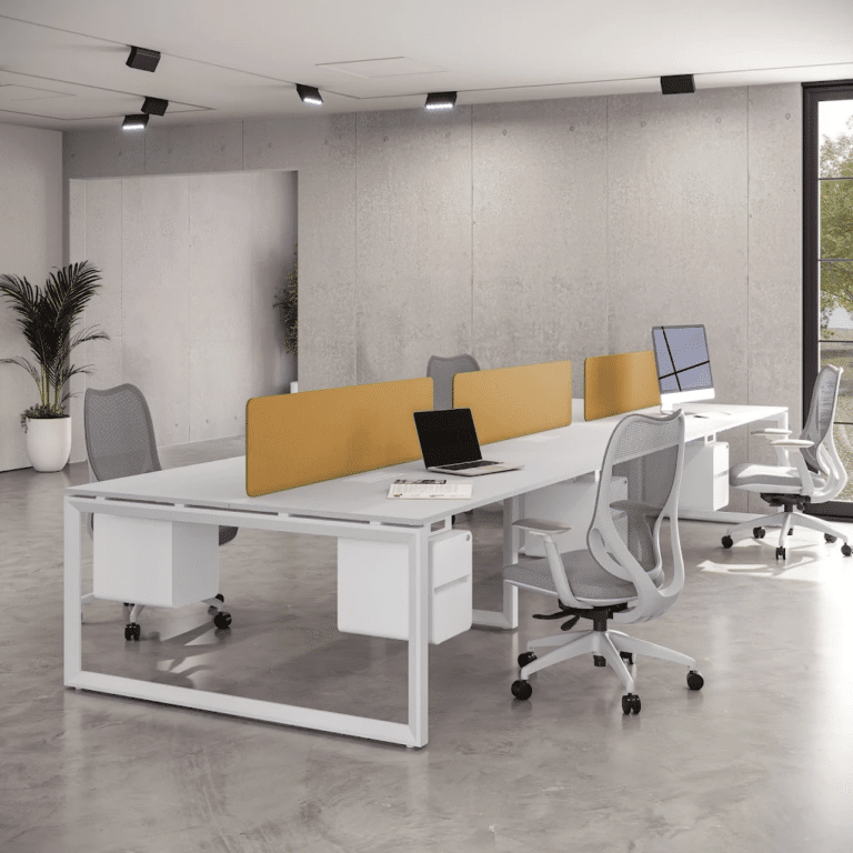
If you’re building a website or decorating your living room, analogous colors examples can change your space from ordinary to extraordinary. They’re forgiving and surprisingly easy to work with.
Are you ready to find out how these color harmonies can improve your next project? Let’s get into it.
Understanding the Power of Analogous Colors
Analogous colors are neighbors on the color wheel; they sit right next to each other like old friends. Think red, orange, and yellow, or blue, green, and teal.
Key characteristics:
- They share a standard base color
- Create natural visual flow
- Feel harmonious and pleasing to the eye
- They are found everywhere in nature
The magic happens through visual cohesion. When colors are related, they create a sense of unity. Your brain doesn’t have to work hard to process them. This makes websites easier to navigate and rooms more comfortable to be in.
Core Analogous Colors Examples
Here are four powerful analogous color schemes that work beautifully in both digital and physical spaces.
I’ve found that these combinations create seamless harmony, whether you’re designing a website or decorating a room, as they utilize colors that naturally flow into one another on the color wheel.
The gentle modifications between these neighboring hues appear effortless to the eye, and they’re forgiving enough that you can experiment with different shades and intensities without compromising the cohesive, polished look that makes any space feel intentionally designed.
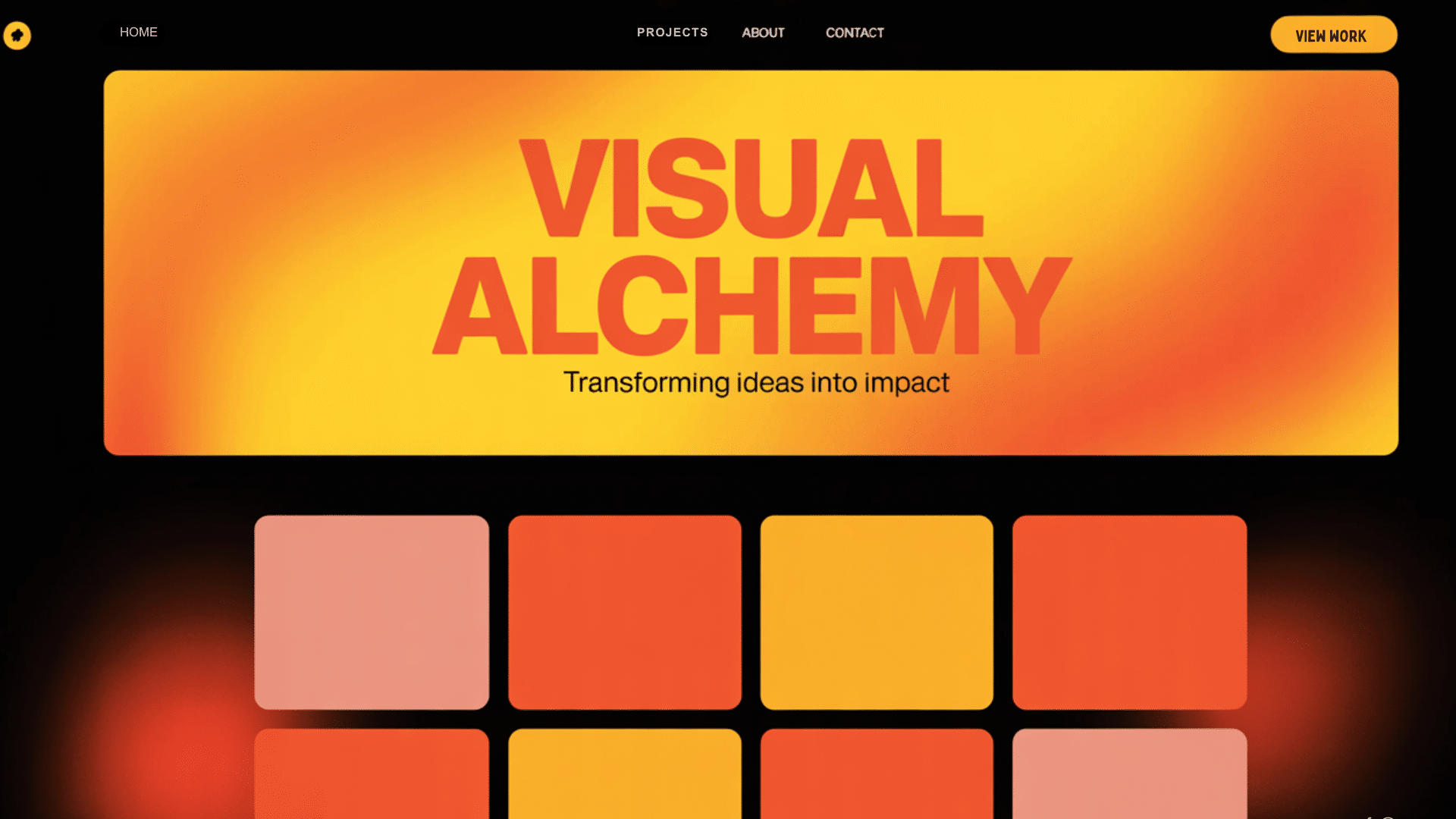
Warm Analogous Colors (Red–Orange–Yellow)

This fiery trio screams energy and confidence, making it impossible to ignore.
I love how these warm tones create an instant mood boost; perfect for brands that want to stand out from the crowd and aren’t afraid to make a bold statement.
In physical spaces, this combination brings life to rooms that need motivation, such as home offices or dining areas where you want conversations to flow enthusiastically.
Ideal applications:
- Restaurant websites and kitchens
- Creative portfolio sites
- Living rooms that need warmth
- Fitness or sports-related designs
Tip: Use yellow as your accent color. It’s the brightest and draws attention without overwhelming.
Cool Analogous Colors (Blue–Green–Cyan)

The ultimate calming combination that instantly evokes images of peaceful ocean views and endless summer skies.
These colors evoke images of water, sky, and serene landscapes; there’s something deeply soothing about how they flow together like gentle waves.
I find this palette works magic in bedrooms, bathrooms, or any space where you want to unwind, and it’s equally powerful for wellness brands or apps that need to feel trustworthy and tranquil.
Ideal applications:
- Healthcare and wellness websites
- Bedrooms and bathrooms
- Tech companies want to appear trustworthy
- Spa and meditation spaces
Tip: Let blue dominate, use green as a supporting color, and add cyan for fresh accents.
Neutral-Tinted Analogous Palettes (Beige–Brown–Burnt Orange)

Earthy and sophisticated, this palette feels like a walk through an autumn forest where every shade has its place.
These colors feel grounded and natural, perfect for the biophilic design trend that’s all about bringing the outdoors in; I love how they create that instant connection to nature without feeling rustic or unpolished.
If you’re designing a spa website or decorating a living room, this combination brings warmth and stability that makes people feel comfortable and at ease.
Ideal applications:
- Coffee shop websites and interiors
- Minimalist home designs
- Sustainable brand identities
- Cozy reading nooks
Unexpected Analogous Triads (Purple–Magenta–Pink)

Bold and playful, this combination breaks expectations while maintaining harmony in the most delightful way.
I love how it surprises you; these colors shouldn’t work together according to traditional rules, but they create this vibrant energy that feels both unexpected and perfectly balanced.
It’s ideal for creative brands that want to show their innovative side or spaces where you want to spark curiosity and conversation without overwhelming the senses.
Ideal applications:
- Creative agencies and art portfolios
- Beauty and fashion brands
- Kids’ spaces and playrooms
- Avant-garde interior statements
Analogous Colors Examples in Web Design
Web design is where analogous colors shine. They create intuitive user experiences and memorable brand identities.
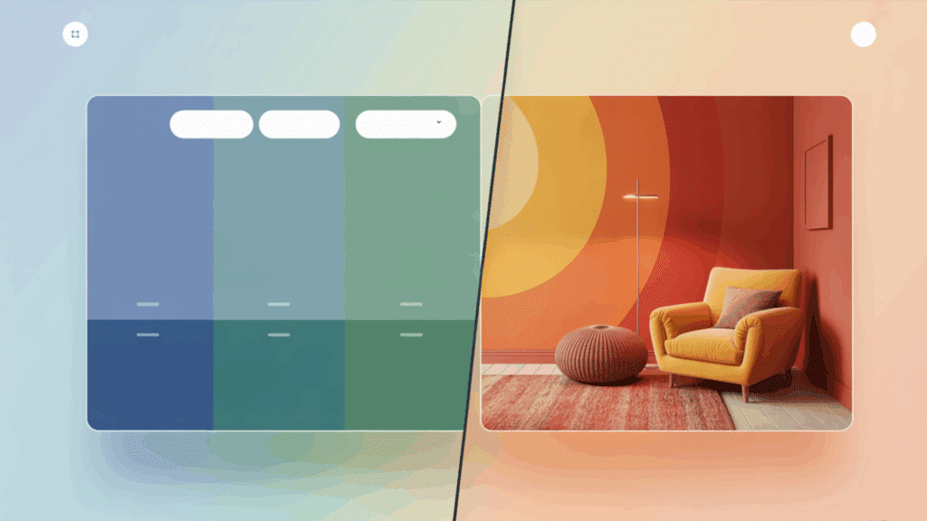
Start with your dominant color; this accounts for approximately 60% of your design. Pick two neighboring colors for support (30%) and accents (10%).
The hierarchy works like this:
- Dominant: Background, main sections.
- Supporting: Navigation, secondary elements.
- Accent: Buttons, links, calls-to-action.
This approach ensures your site feels unified while maintaining a clear visual hierarchy.
Example 1: Wellness Website (Green–Blue–Teal)
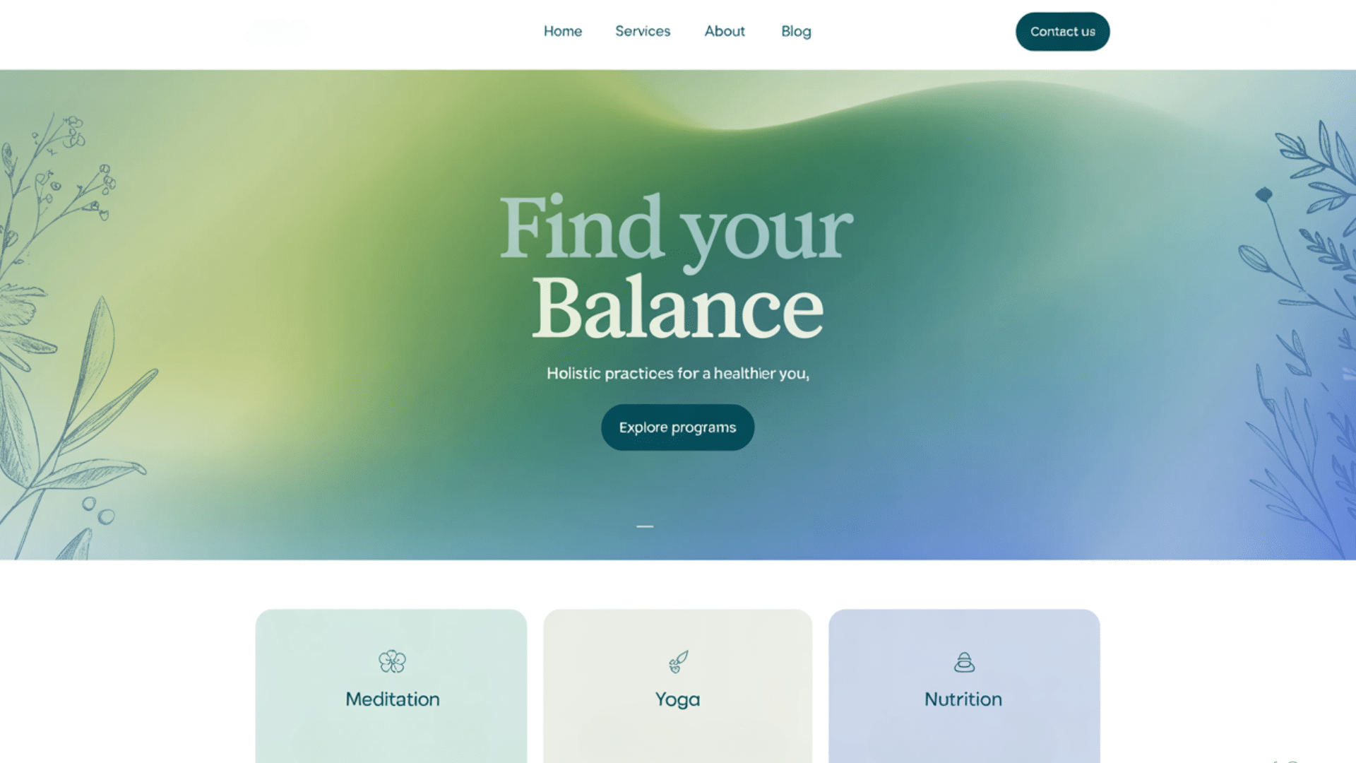
Imagine a yoga studio’s website. Deep forest green dominates the background. Soft blue highlights the navigation and section headers. Bright teal accents the “Book Now” buttons.
Why it works:
- Green suggests nature and growth.
- Blue adds trust and calm.
- Teal creates fresh, modern energy.
Example 2: Creative Portfolio (Orange–Red–Coral)
A graphic designer’s portfolio site bursts with warm energy. Burnt orange backgrounds showcase work samples. Deep red highlights project titles. Coral accents highlight visitors ‘ contact information.
Why it works:
- Orange sparks creativity and enthusiasm.
- Red demands attention and confidence.
- Coral adds approachable warmth.
Example 3: Tech Startup Website (Blue–Indigo–Purple)
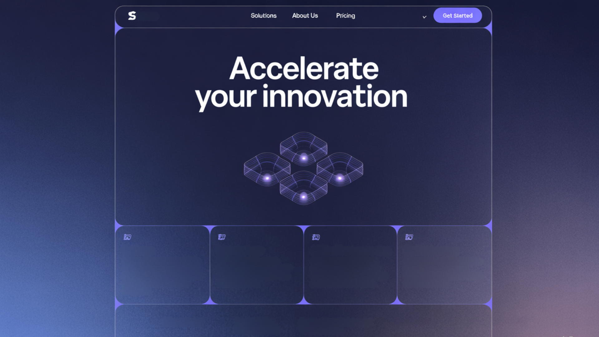
A sleek tech company’s homepage uses deep navy blue for the hero section. Indigo shades highlight features and services. Vibrant purple is used in call-to-action buttons and iconography.
Why it works:
- Blue conveys intelligence and professionalism.
- Indigo adds a sense of innovation and depth.
- Purple brings a creative, futuristic edge.
Example 4: Luxury Spa Site (Pink–Rose–Lavender)
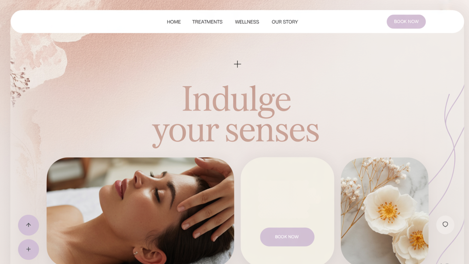
An upscale spa website uses a blush pink background for softness. Rose hues add elegance to headers and overlays. Lavender is used subtly in buttons and accent graphics.
Why it works:
- Pink creates a soothing, feminine feel.
- Rose evokes elegance and sophistication.
- Lavender adds a gentle, calming luxury.
Analogous Colors Examples in Interior Design
Interior spaces tell stories through color. Analogous schemes help you craft those narratives with intention and style.
Every room has a purpose. Analogous color schemes support that purpose by creating the right emotional environment.
Why is this connection powerful?
- Colors influence how we feel in spaces.
- Analogous schemes feel natural and comfortable.
- They create a flow between connected rooms.
Example 1: Calming Bedroom (Lavender–Lilac–Soft Blue)
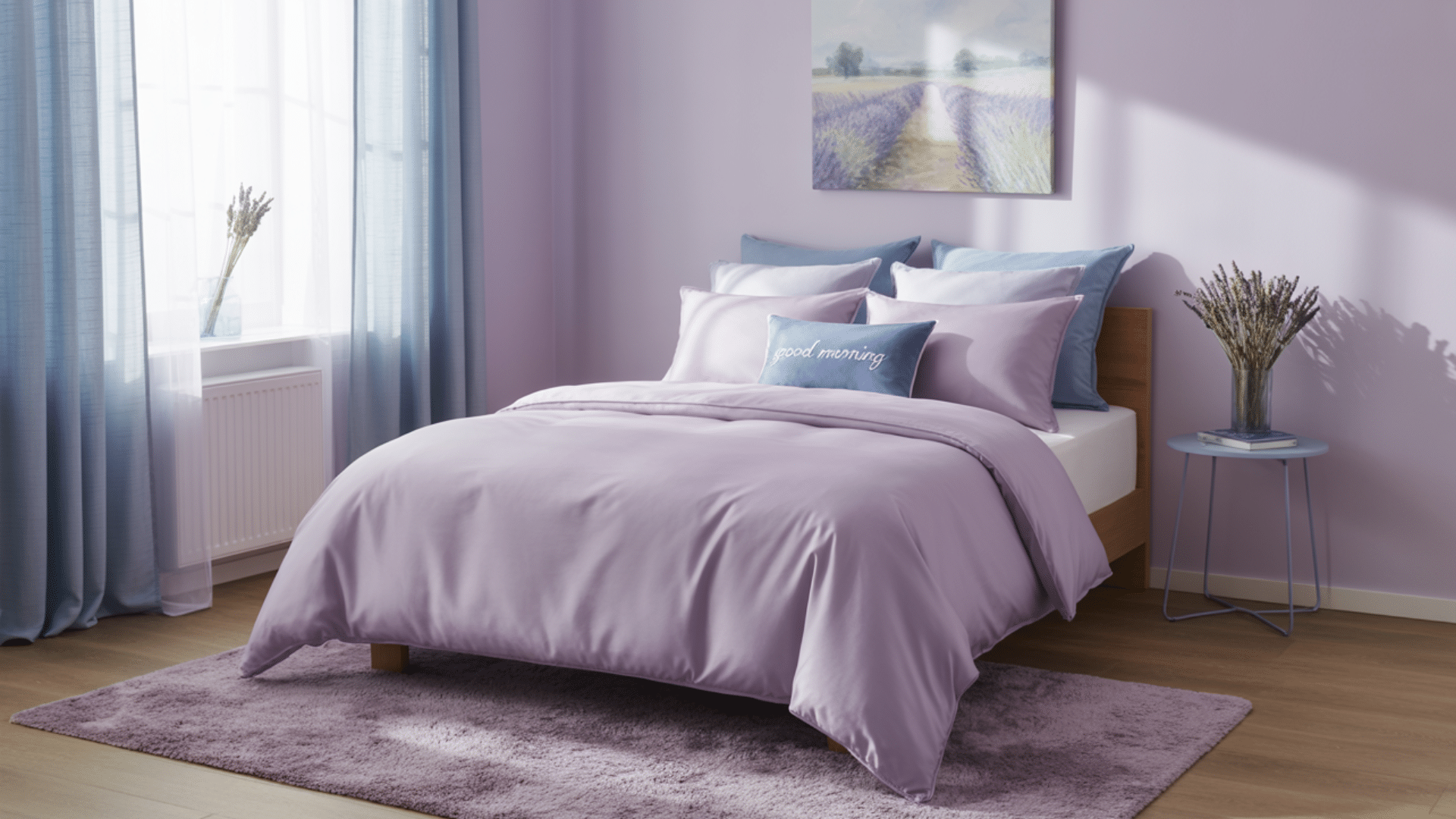
Picture this: lavender walls create a dreamy backdrop. Lilac bedding and curtains add softness. Soft blue accents in artwork and pillows complete the tranquil scene.
Why this works:
- Purple promotes relaxation and creativity
- The gradual shift to blue enhances calm
- Light tones prevent overwhelming the space
Design balance:
- Use matte paint finishes to soften the colors
- Add texture with linen and cotton fabrics
- Include natural wood to ground the palette
Example 2: Lively Kitchen (Yellow–Orange–Red)
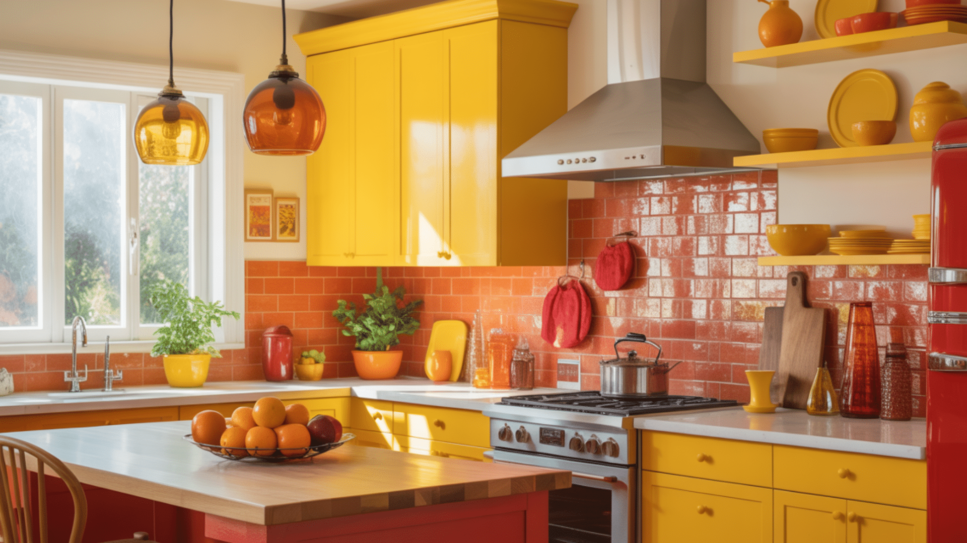
A kitchen that energizes. Sunny yellow cabinets brighten the space. Orange backsplash tiles add warmth. Red accents in small appliances and barstools create focal points.
Why this works:
- Warm colors stimulate hunger.
- Yellow promotes happiness and energy.
- Orange and red create social atmospheres.
Design balance:
- Use white or cream countertops to calm the intensity.
- Add green plants for natural contrast.
- Include stainless steel for modern coolness.
Example 3: Serene Living Room (Sage Green – Olive – Forest Green)

A nature-inspired haven. Soft sage green walls provide a peaceful base. Olive green sofas add warmth and sophistication. Deep forest green in rugs, throws, and indoor plants brings depth and richness.
Why this works:
- Green tones evoke nature, harmony, and renewal.
- The layering of greens creates visual interest without chaos.
- Darker greens ground the space, while lighter ones keep it airy.
Design balance:
- Use neutral-toned furniture (like beige or tan) to avoid monotony.
- Add brass or gold accents for elegance.
- Introduce natural textures like jute, rattan, or linen for warmth and variety.
Example 4: Cozy Reading Nook (Peach – Coral – Terracotta)
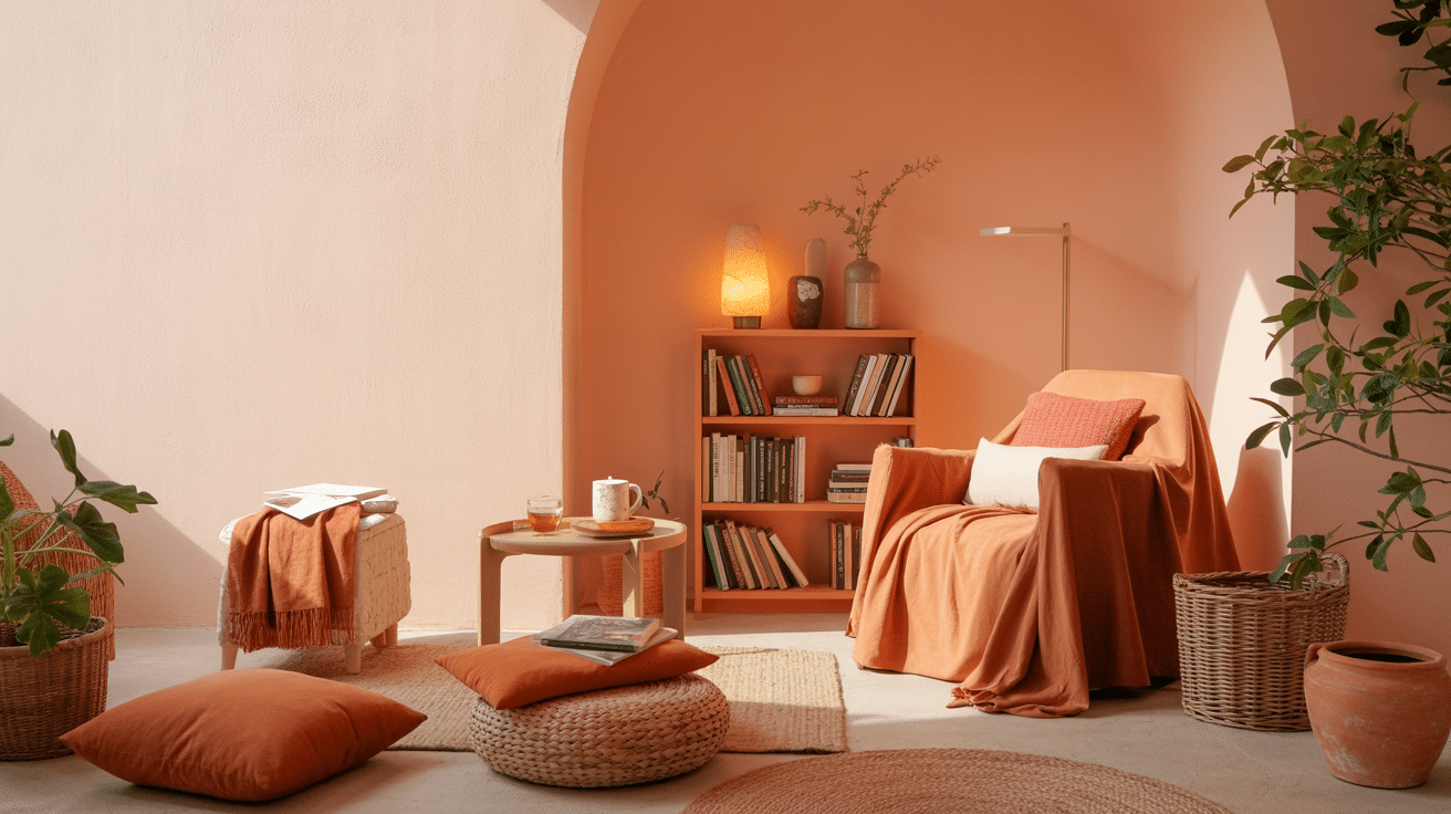
A sunlit corner is perfect for unwinding. Peach-colored walls reflect warmth and light. Coral cushions on a cozy chair add playful charm. Terracotta pottery and throws bring earthy depth.
Why this works:
- These warm tones evoke a sense of comfort and invitation.
- Peach adds softness, coral injects cheer, and terracotta grounds the palette.
- Together, they create a relaxed and intimate atmosphere.
Design balance:
- Use off-white or ivory trims and shelving to frame the colors.
- Add wicker baskets or clay pots for tactile contrast.
- Include soft lighting (like warm LEDs or lanterns) to enhance coziness.
Expert Tips for Using Analogous Colors
These advanced techniques separate amateur attempts from professional results. Master these strategies and you’ll create analogous color schemes that feel intentional and sophisticated.
The difference lies in understanding balance, contrast, and strategic color placement.
- Vary saturation levels: Mix muted and vibrant versions to avoid monotony
- Choose one dominant color: Let one hue take the lead while others support
- Add strategic neutrals: Use white, gray, or black to prevent color overwhelm
- Apply the 60-30-10 rule: Dominant color 60%, supporting 30%, accent 10%
- Create a clear contrast: Ensure colors are distinct enough for readability
- Ground with earth tones: Natural materials anchor bright analogous schemes
Final Thoughts
Analogous colors examples aren’t just a design theory; they’re your pathway to creating spaces and websites that feel effortlessly cohesive.
From calming blue-green combinations in wellness sites to energizing orange-red schemes in vibrant kitchens, these color harmonies solve the guesswork in design decisions.
The charm of analogous colors lies in their forgiveness. Unlike complex color theories that require years to master, these neighboring hues work together naturally.
Start experimenting today, as your next project deserves that seamless color flow.
ae