Ever lie in bed staring at walls that just feel wrong? Your bedroom should help you relax, but the wrong paint color can actually keep you awake or make you feel anxious.
The color on your walls affects your mood more than you think. Harsh whites feel cold. Bright colors overstimulate. Dark shades can feel heavy.
But here’s what works: soft, muted tones that calm your nervous system and help you wind down.
In this guide, you’ll learn what makes a color truly calming, see 16 peaceful paint options with real pairing ideas, and get practical tips for choosing the perfect shade for your space.
What Makes a Bedroom Paint Color Feel Calm?
A bedroom paint color feels calm when it has low intensity and soft undertones. Colors with lower saturation appear muted rather than bright. They don’t stimulate your eyes or mind.
Cooler tones like blues and greens naturally relax the nervous system. Warm neutrals like beige and greige create a cozy, secure feeling.
The key is choosing colors that reflect light gently without overwhelming the space. When you pick calm bedroom paint colors, you’re really selecting hues that help your brain shift into rest mode.
Quick Checklist Before Picking Calm Bedroom Paint Colors
Before you commit to a color, you need to consider a few important factors. This simple checklist will help you make the right choice for your space.
Consider these key factors:
- Room lighting – Check how much natural light enters your bedroom throughout the day
- Existing furniture – Your paint should complement your bed frame, dresser, and decor
- Room size – Lighter shades make small rooms feel bigger, while darker tones work in larger spaces
- Personal preference – Choose colors that genuinely make you feel relaxed and happy
- Undertones – Test paint samples on your wall to see how undertones change in different lighting
- Finish type – Matte and eggshell finishes create softer, more calming effects than glossy ones
- Temperature – Decide if you want cool tones (blues, greens) or warm neutrals (beiges, taupes)
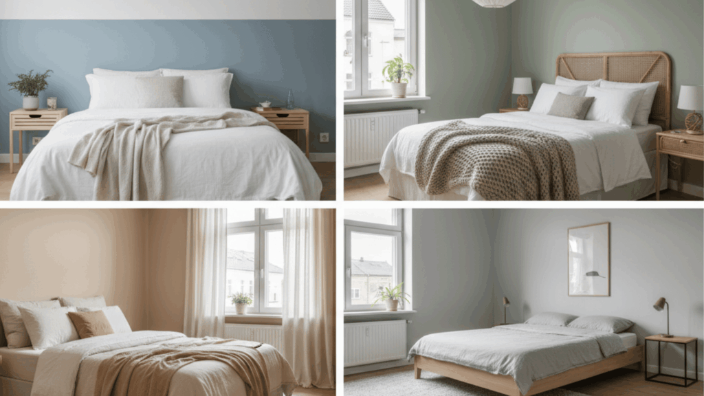
Best Calm Bedroom Paint Colors
Now let’s look at the best color options for creating a peaceful sleep space. Each of these calm bedroom paint colors brings its own unique mood and style.
1. Soft Warm White
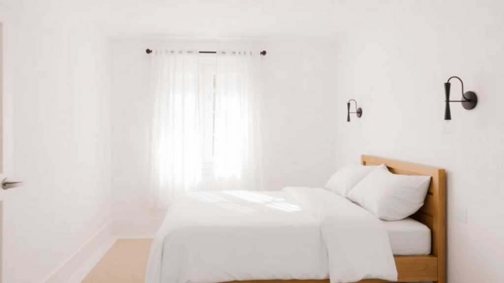
This color looks like fresh cream with a hint of yellow. It feels clean but never cold or sterile. The subtle warmth prevents that stark, clinical feeling. It reflects light beautifully throughout the day.
- Best for: Small bedrooms, north-facing rooms, and spaces that need more brightness without feeling stark.
- Pairs well with: Natural wood furniture, linen bedding, and touches of black or charcoal for contrast.
2. Creamy Off-White
This shade has more yellow undertones than standard white. It creates a cozy, inviting atmosphere that wraps around you. The creaminess adds richness without being heavy. It works in almost any lighting condition.
- Best for: Master bedrooms, guest rooms, and any space where you want warmth without adding bold color.
- Pairs well with: Brass fixtures, cream bedding, terracotta accents, and wicker or rattan pieces.
3. Pale Greige
This color blends gray and beige perfectly. It looks neutral but has depth and sophistication. The balanced undertones mean it never reads too cool or too warm. It adapts to your room’s lighting throughout the day.
- Best for: Modern bedrooms, minimalist spaces, and rooms with lots of natural light.
- Pairs well with: White trim, gray textiles, blush pillows, and both warm and cool metal finishes.
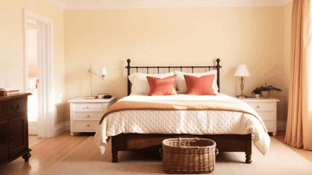
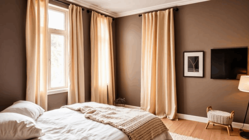
4. Warm Beige
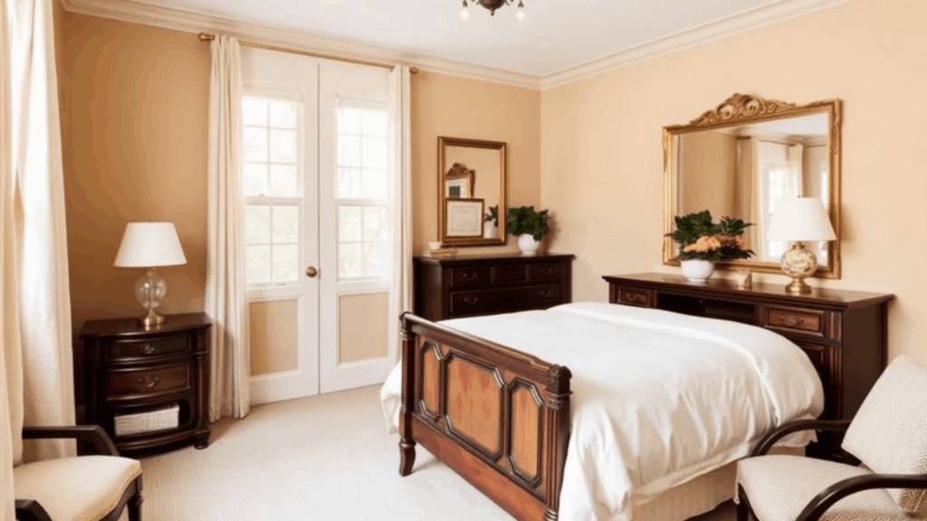
This classic shade leans toward tan with subtle warmth. It feels grounded and secure. The earthy quality brings outdoor comfort inside. It creates a consistent, stable backdrop for any decor style.
- Best for: Traditional bedrooms, larger spaces, and rooms where you want a cozy, comforting vibe.
- Pairs well with: Dark wood furniture, ivory linens, gold accents, and green plants for a natural touch.
5. Soft Taupe
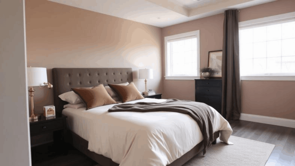
This color sits between brown and gray with earthy undertones. It looks refined without being too formal. The complexity keeps it interesting over time. It never feels boring or one-dimensional.
- Best for: Contemporary bedrooms, south-facing rooms, and spaces that get plenty of natural light.
- Pairs well with: Cream bedding, velvet textures, rose gold hardware, and darker wood tones.
6. Misty Light Gray
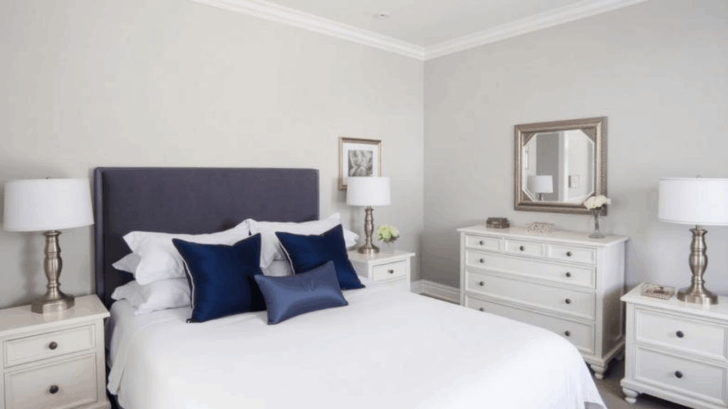
This shade is a true soft gray without strong undertones. It feels clean, fresh, and modern. The misty quality softens the coolness of pure gray. It creates a serene backdrop that doesn’t compete with your decor.
- Best for: Small to medium bedrooms, north-facing spaces, and rooms with white or light wood floors.
- Pairs well with: White furniture, navy accents, silver fixtures, and crisp white bedding for a hotel look.
7. Warm Mushroom Gray
This color combines brown and gray with a slight taupe undertone. It looks earthy and organic. The warmth prevents it from feeling cold like standard gray. It brings nature’s calming effect indoors.
- Best for: Cozy bedrooms, reading nooks, and spaces where you want a cocoon-like feeling.
- Pairs well with: Linen textiles, natural wood, matte black accents, and cream or ivory tones.
8. Dusty Rose Beige
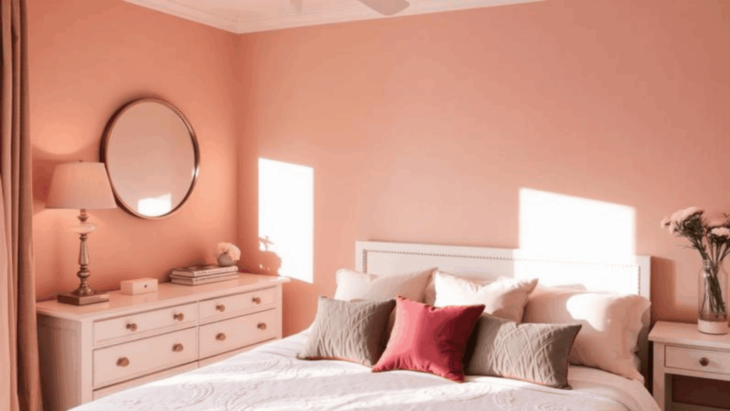
This shade blends beige with the softest hint of pink. It looks subtle and feminine without being overly sweet. The dusty quality keeps it mature and sophisticated. It shifts beautifully from morning to evening light.
- Best for: Romantic bedrooms, guest rooms, and spaces with good natural light to prevent them from looking too pink.
- Pairs well with: White furniture, gold accents, gray throws, and soft pink or mauve pillows.
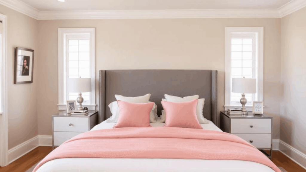
9. Pale Blush Pink
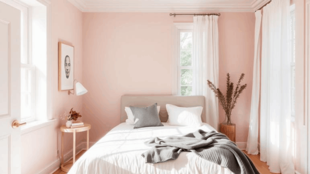
This color is a whisper of pink that almost reads as neutral. It feels gentle and soothing. The paleness keeps it from looking juvenile or too bold. It adds warmth without any harshness.
- Best for: Well-lit bedrooms, smaller spaces that need warmth, and rooms with white or light trim.
- Pairs well with: White bedding, brass hardware, gray accents, and natural wood furniture for balance.
10. Muted Lavender Gray
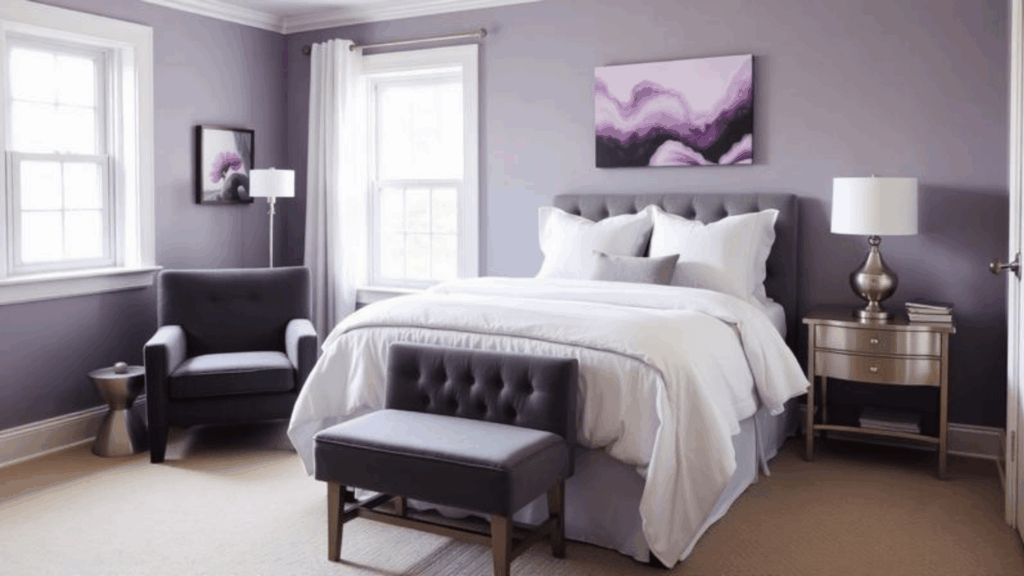
This shade has more gray than purple but keeps a soft lavender tone. It looks dreamy and peaceful. The muted quality prevents it from feeling too bright or playful. It creates a unique space that still feels restful.
- Best for: Main bedrooms, meditation spaces, and rooms where you want a unique, calm color choice.
- Pairs well with: Charcoal gray, white linens, silver fixtures, and touches of deeper purple or blue.
11. Powder Blue
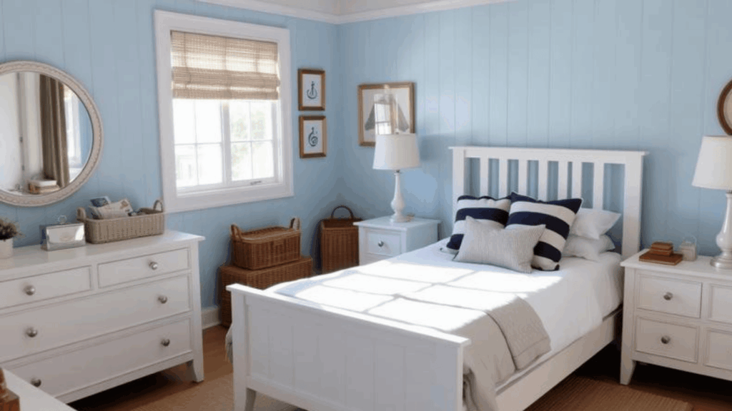
This color is a soft, gentle blue that feels airy and light. It brings the sky indoors. The powder softness keeps it from feeling cold. It visually opens up your space and lifts the mood.
- Best for: Small bedrooms, hot climates, and spaces where you want a cooling, fresh atmosphere.
- Pairs well with: White furniture, natural textures, navy accents, and sandy beige tones.
12. Dusty Denim Blue
This shade is a muted blue with gray undertones. It looks mature and grounded, not childish. The dusty finish adds sophistication and depth. It feels both comfortable and stylish at once.
- Best for: Larger bedrooms, rooms with plenty of light, and spaces where you want more color personality.
- Pairs well with: White trim, camel or tan accents, brass fixtures, and cream or ivory bedding.
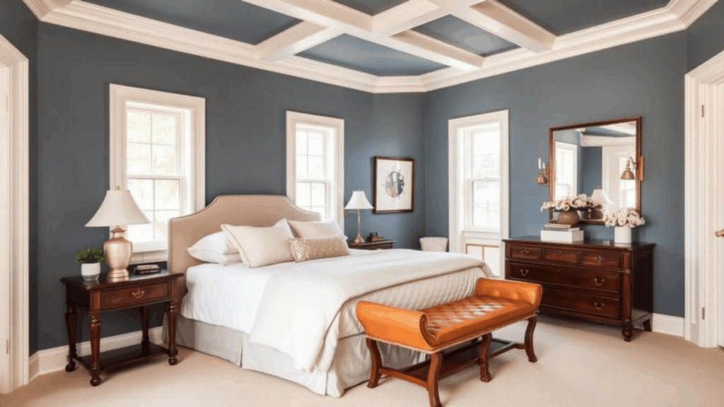
13. Smoky Blue Gray
This color leans more blue than gray but stays muted. It feels moody yet calming. The smoky quality adds mystery without darkness. It creates depth while maintaining a peaceful atmosphere.
- Best for: Master bedrooms, well-lit spaces, and modern or coastal-style rooms.
- Pairs well with: White bedding, natural wood, silver hardware, and soft coral or peach accents.
14. Soft Sage Green
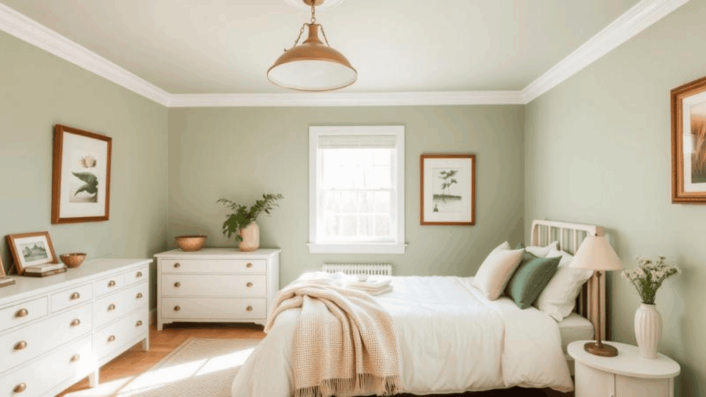
This shade is a muted green with gray undertones. It brings nature inside without being too bold. The softness keeps it restful rather than energizing. It promotes relaxation and mental clarity.
- Best for: Medium to large bedrooms, spaces with white trim, and rooms that get moderate natural light.
- Pairs well with: White furniture, warm wood tones, brass accents, and cream or beige textiles.
15. Misty Seafoam Green
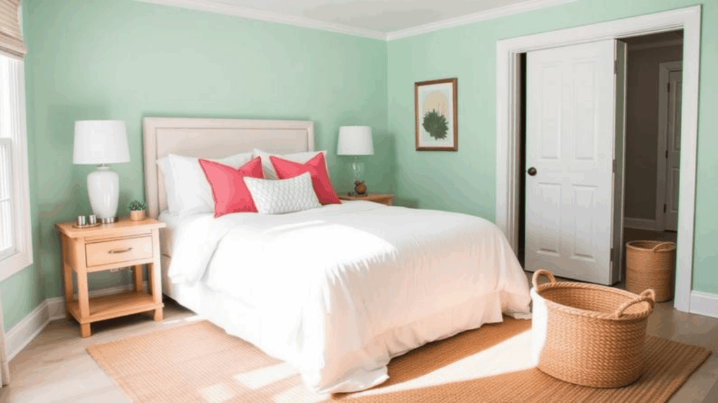
This color blends green, blue, and gray together. It feels spa-like and refreshing. The misty quality softens what could be a bright shade. It evokes calm water and peaceful beaches.
- Best for: Bright bedrooms, coastal or bohemian styles, and spaces where you want a unique, calm option.
- Pairs well with: White bedding, natural rope or jute, light wood, and touches of coral or terracotta.
16. Deep Forest Green
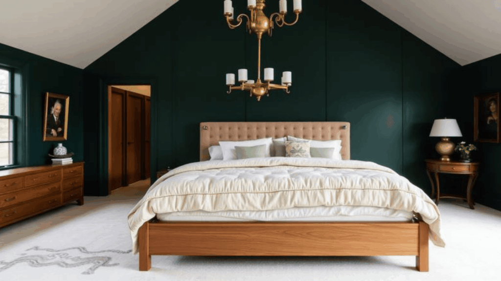
This shade is a darker green that still feels restful. It creates a cozy, wrapped-up feeling. The depth adds richness without overwhelming your senses. It works beautifully for those who want color with calm.
- Best for: Large bedrooms with high ceilings, well-lit spaces, and rooms where you want drama with calm.
- Pairs well with: Brass or gold fixtures, cream bedding, natural wood, and lighter green or blush accents.
Top Paint Brands to Explore for Bedroom Colors
Once you’ve chosen your calm bedroom paint colors, you need to pick a reliable brand. Here are the most trusted paint companies used by homeowners and professionals across the country.
1. Sherwin-Williams
This brand has been around since 1866 and offers excellent coverage. Their paints come in thousands of colors with multiple finish options. You’ll find their stores in almost every city, making it easy to get help and match colors. The quality stays consistent across their product lines.
2. Benjamin Moore
This company is known for rich pigments and smooth application. Their paints often need fewer coats to achieve full coverage. Many interior designers choose this brand for high-end projects. The color accuracy remains true from sample to gallon.
3. Behr
You can find this brand exclusively at Home Depot stores. Their paints offer good quality at more affordable prices than premium brands. They provide paint and primer in one for many products. The wide range of finishes works for any budget or project size.
4. Valspar
This brand is sold at Lowe’s and independent retailers. Their formulas resist fading and stand up well to cleaning. The color selection includes both trendy and classic options. Many homeowners appreciate the balance between quality and cost.
5. Farrow & Ball
This British brand is famous for its unique, complex colors. Their paints use high-quality ingredients and eco-friendly formulas. The price point is much higher than standard brands. Designers love the depth and character their colors bring to spaces.
Calm Bedroom Color Pairings That Always Work
Choosing calm bedroom paint colors is just the first step. You also need to know what to pair them with for a complete, cohesive look.
- Calm paint colors with white trim: White trim creates crisp, clean lines that make any calm color pop without adding visual noise or competition.
- Calm paint colors with wood furniture: Natural wood tones add warmth and texture that complement soft paint colors, creating a balanced, grounded space.
- Calm paint colors with black accents: Black details, such as frames, lamps, or hardware, add definition and prevent the colors from feeling washed out or flat.
- Calm paint colors with warm bedding tones: Beige, cream, tan, and caramel bedding create a cozy nest feeling when paired with soft wall colors.
- Calm paint colors with cool bedding tones: Gray, white, navy, and soft blue linens give your bedroom a fresh, crisp, hotel-like atmosphere.
How to Choose the Best Shade for Your Bedroom?
Start by testing paint samples on your actual walls. Paint large swatches, not tiny squares, so you can see how the color changes throughout the day.
Look at the samples in morning light, afternoon sun, and evening lamp light. Consider your bedroom’s size, the amount of natural light it gets, and the colors of your existing furniture.
Think about the mood you want to create when you walk into the room. Cool tones like blues and greens work well in rooms that get hot or face south.
Warm neutrals feel better in north-facing or darker rooms. Trust your gut feeling after living with the samples for at least 48 hours before making your final choice.
Final Thoughts
Choosing calm bedroom paint colors doesn’t have to be complicated.
Start with the mood you want to create. Test samples on your walls under different lighting conditions. Pay attention to how each color makes you feel when you walk into the room.
Remember, the best color is one that helps you relax and sleep better. Soft neutrals, muted blues, gentle greens, or warm beiges all work beautifully. Match them with the right trim, furniture, and bedding for a complete look.
Ready to make your bedroom the peaceful retreat you deserve? Grab some paint samples this weekend and start testing. Your better sleep is just one coat of paint away.
What calm color are you leaning toward? Drop a comment below and let us know!