Ever wonder why some artwork grabs your attention instantly while others leave you scrolling past? The secret isn’t talent or expensive tools.
It’s the composition in art, the way elements get arranged on a canvas. Think of it like this: two artists paint the same sunset. One ends up on a gallery wall. The other sits forgotten in a closet.
What’s different? How they placed shapes, controlled values, and guided your eye through the piece.
This guide breaks down everything from basic elements like line and color to advanced techniques like the rule of thirds and visual hierarchy.
You’ll learn practical exercises, spot common mistakes, and discover a repeatable workflow that works for any medium.
What Is Composition in Art?
Composition in art is the arrangement of visual elements on a canvas or page. Think of it like organizing furniture in a room. You place shapes, lines, colors, and textures where they work best together. Good composition guides your viewer’s eyes exactly where you want them to look.
Composition vs. Design vs. Layout
| Term | What It Means | Example |
|---|---|---|
| Composition | The overall arrangement of all visual elements in your artwork | How you organize shapes, colors, and lines across the entire painting |
| Design | The process of creating harmony and balance between elements | Choosing colors that complement each other and shapes that flow together |
| Layout | The specific placement and positioning of elements within your space | Deciding to place your focal point in the upper right corner instead of the center |
Your real job as an artist is controlling where people look. Composition in art gives you that power. You can guide someone’s gaze from one part of your work to another, creating a natural visual path. Rules help, but your choices matter more. Want to create tension? Break a rule on purpose.
5 Key Elements of Composition in Art
Now that you know what composition means, let’s look at the building blocks that make it work. These five elements give you the tools to create art that connects with viewers.
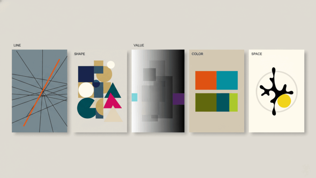
1. Line
Lines define shapes, create movement, and first direct your viewer’s gaze. Horizontal lines feel calm and restful, vertical lines show strength and stability, and diagonal lines bring energy and action to your work.
2. Shape
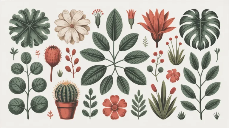
Shapes are the building blocks of every composition in art, from simple geometric forms like circles and squares to organic, free-flowing shapes found in nature. How you arrange these shapes creates harmony, tension, or contrast, making your artwork interesting.
3. Value
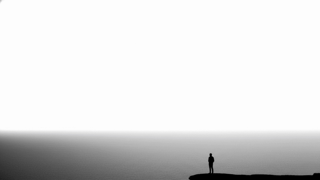
Value is the difference between light and dark areas in your artwork, and it creates depth and mood while making your composition easy to read. Strong value contrast helps viewers understand your work, even from afar or when it’s shown as a small thumbnail.
4. Color
Color sets the emotional tone of your piece and tells viewers where to focus their attention first. Using complementary colors creates vibrant contrast, while analogous colors bring harmony and unity to your composition.
5. Space
Positive space is your subject, and negative space is the empty area around it; both work together to balance your composition. Using foreground, middle ground, and background layers creates depth and pulls viewers into your artwork.
11 Composition Concepts That Every Artist Should Master
You’ve learned the basic elements, so now let’s explore specific techniques that bring them together. These 11 concepts will transform how you arrange elements in your artwork and help you create stronger, more compelling pieces.
1. Rule of Thirds
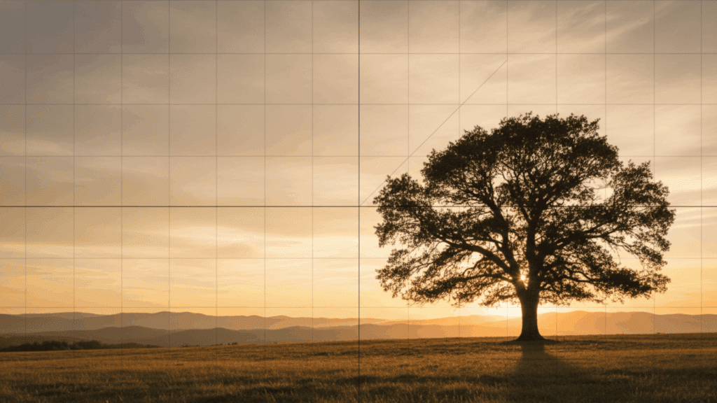
The rule of thirds splits your canvas into nine equal parts using two horizontal and two vertical lines. Place your focal point where these lines cross, and your composition feels instantly more balanced and interesting. Off-center subjects create tension and visual interest that centered subjects often lack.
Key Points:
- Draw an imaginary grid with two lines each way
- Position important elements at the intersections
- Avoid placing your subject dead center
2. Leading Lines

Leading lines act like arrows pointing viewers toward your focal point. These can be actual lines like roads, rivers, or fences, or implied lines created by shadows, brushstrokes, or the direction a figure faces. They create a natural path for the eye to follow through your artwork.
Key Points:
- Use roads, paths, or rivers as natural guides
- Shadows and edges work as implied lines
- Direct multiple lines toward your main subject
3. Framing
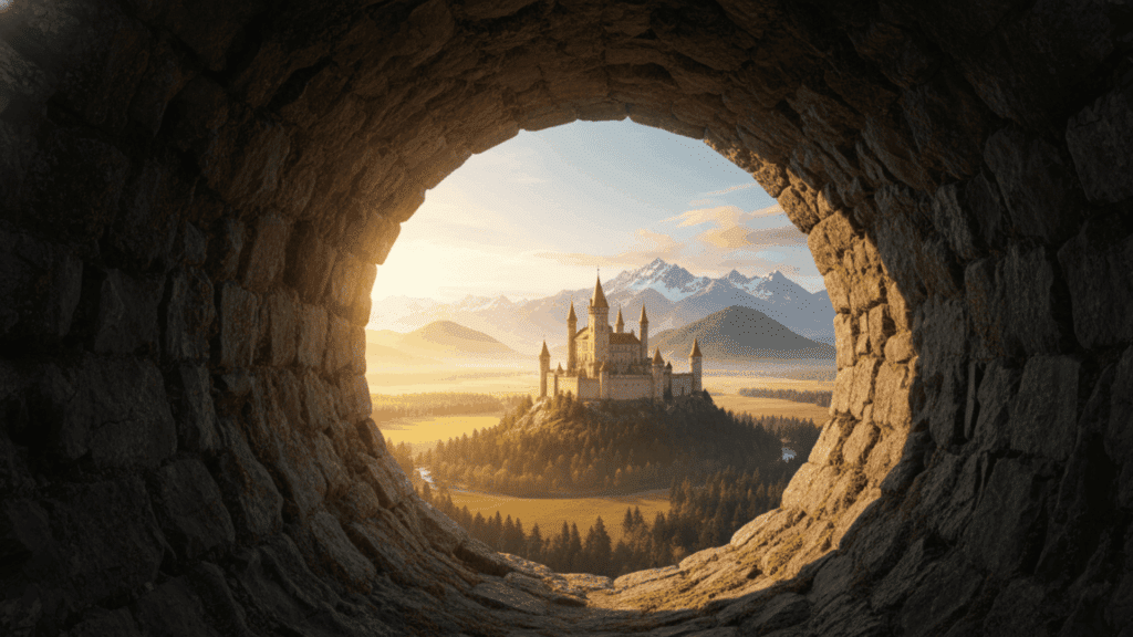
Framing uses objects in your scene to create a border around your subject. Windows, doorways, tree branches, or archways naturally draw attention inward. This technique makes all points feel more important and anchors them firmly in the composition.
Key Points:
- Use natural elements like trees or architectural features
- Create depth by framing the foreground against the background
- Keep frames darker to push focus toward the subject
4. Balance
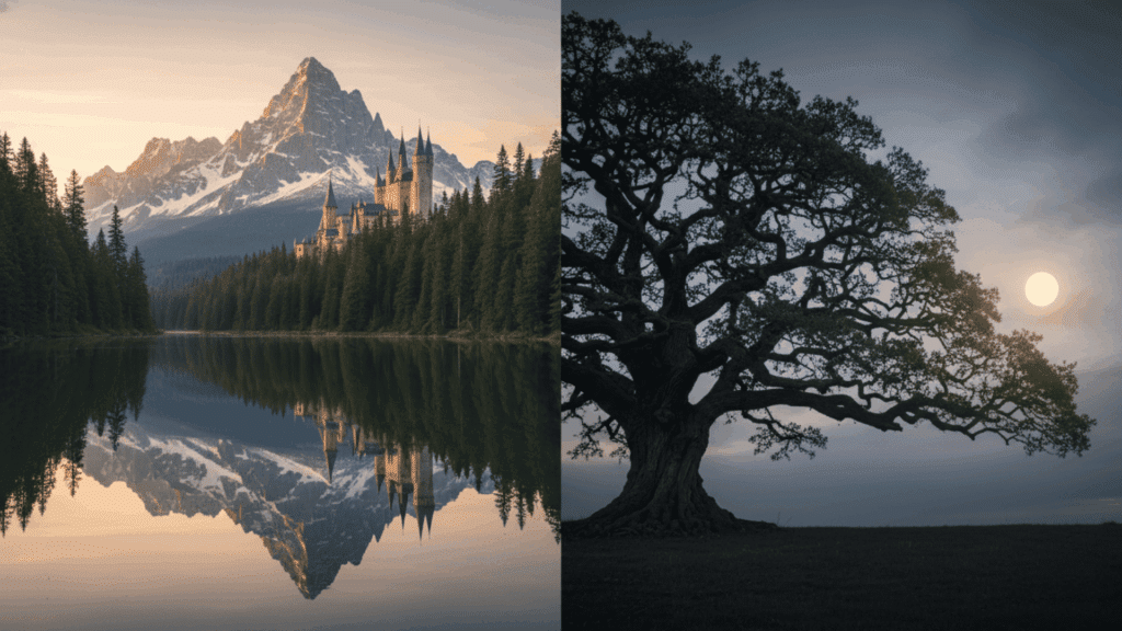
Balance distributes visual weight across your composition in art so nothing feels too heavy on one side. Symmetrical balance creates a formal, calm feeling, while asymmetrical balance adds energy and a modern appeal. Consider how color, size, and detail affect the “heaviness” of each element.
Key Points:
- Symmetry works for traditional, formal artwork
- Asymmetry creates dynamic, interesting compositions
- Balance bright colors with neutral areas
5. Contrast
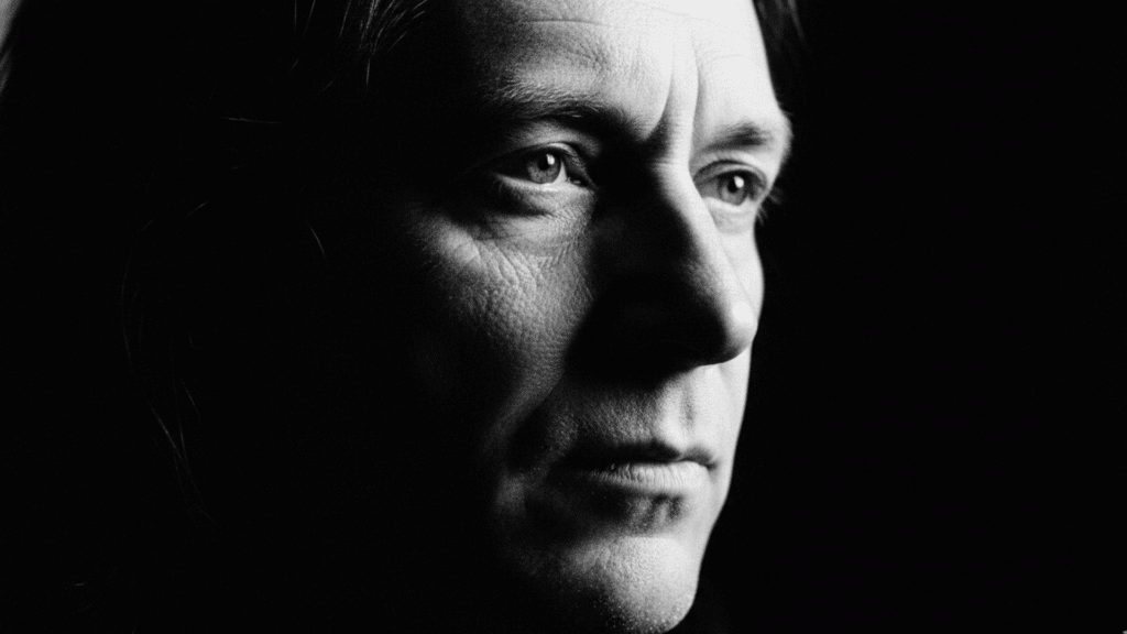
Contrast makes certain parts of your artwork pop by creating clear differences. You can use light versus dark values, bright versus muted colors, or rough versus smooth textures. High contrast creates drama and excitement, while low contrast feels softer and more peaceful.
Key Points:
- Place the lightest lights next to the darkest darks for impact
- Use color contrast to highlight important areas
- Soft contrast creates mood and atmosphere
6. Hierarchy

Hierarchy tells viewers what to look at first, second, and third in your composition. Your focal point gets the most detail, sharpest edges, and strongest contrast. Secondary elements support the main subject but stay quieter with less detail and softer edges.
Key Points:
- Make your focal point the sharpest and most detailed
- Reduce detail in supporting elements
- Use value and color to show importance levels
7. Rhythm and Repetition
Rhythm in composition comes from repeating similar shapes, colors, or patterns throughout your artwork. This repetition creates visual flow and movement that guides the eye naturally. Breaking the pattern occasionally adds interest and catches attention at key moments.
Key Points:
- Repeat colors, shapes, or textures for unity
- Vary the size or spacing slightly for interest
- Break the pattern at your focal point
8. Negative Space
Negative space is the empty area around and between your subjects. This “breathing room” keeps your composition in art from feeling crowded and gives viewers’ eyes a place to rest. Sometimes what you leave out matters just as much as what you include.
Key Points:
- Leave empty areas to balance busy sections
- Use negative space to define your subject’s shape
- More space creates calm, minimal feelings
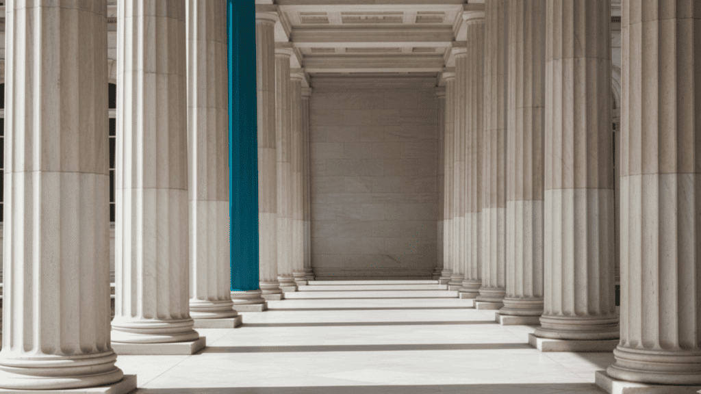
9. Emphasis
Emphasis makes your focal point impossible to ignore by making it stand out from everything else. Increase sharpness, detail, and contrast around your main subject while keeping other areas softer. You can also use size, color, or unusual placement to create emphasis.
Key Points:
- Add the most detail to your focal point
- Surround it with strong value contrast
- Use a pop of bright color to draw attention
10. Unity
Unity means all parts of your composition work together as one complete piece. Consistent color palettes, repeated shapes, and similar textures create harmony throughout your artwork. Unity prevents your piece from looking scattered or chaotic, even with many different elements.
Key Points:
- Stick to a limited color palette
- Repeat similar shapes in different sizes
- Use consistent brushwork or texture throughout
11. Movement
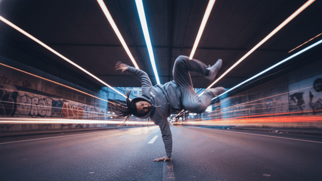
Movement creates the feeling of action or guides the eye through your composition, guiding it along a specific path. Diagonal lines, overlapping shapes, and directional cues, such as a figure’s gaze, all suggest motion. This flow keeps viewers engaged as they explore your entire artwork.
Key Points:
- Use diagonals instead of horizontal or vertical lines
- Overlap elements to suggest depth and motion
- Point gestures or gaze toward your focal point
How to Apply Composition in Different Art Mediums
Composition in art works the same way, no matter what tools you use, but each medium has unique strengths you can use to your advantage. Understanding how to apply compositional principles to your specific medium helps you work smarter and get better results.
- Drawing and Graphite: Master value control and edge quality in graphite work, keeping your silhouettes clean and readable even without color to guide the eye.
- Painting: Block in big shapes first and save details for last, using your brushwork direction to create movement and guide viewers through your composition.
- Digital Art: Use separate layers to test value maps quickly, and flip to grayscale often to check if your composition reads clearly without relying on color.
- Photography Reference vs Imagination: Study your reference photos for problems before you start, and when combining multiple references, simplify value groups to avoid visual chaos.
How to Plan Better Compositions: 6 Simple Steps
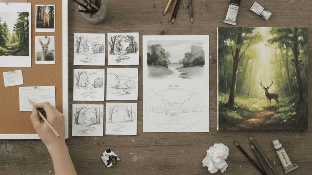
Following a clear process takes the guesswork out of creating strong compositions. This six-step workflow helps you make better decisions from start to finish, whether you’re working on a quick sketch or a detailed painting.
Step 1: Start with The Intent
Before you touch your canvas, decide what viewers should notice first and what feeling you want to create. Ask yourself if this piece should feel calm and peaceful or tense and dramatic. Having a clear goal for your composition in art keeps every choice you make focused and purposeful.
Step 2: Choose the Format and Viewpoint
Your format and angle change how viewers experience your work. Portrait orientation feels intimate and personal, while landscape format suggests openness and space. Eye-level views feel natural and relatable; high angles create distance or an overview feeling; and low angles make subjects feel powerful or imposing.
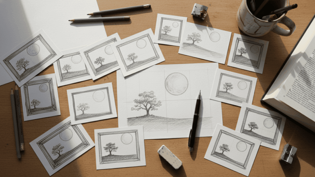
Step 3: Do Thumbnail Options
Sketch three small, quick thumbnails exploring different composition directions. Try one calm and balanced, one dynamic with diagonals, and one dramatic with strong contrast. Pick the thumbnail that communicates your intent most clearly and has the strongest visual impact.
Step 4: Lock in the Value Map
Create a simple value plan using just two or three shades before adding any detail. This notan approach shows you exactly where your darks, lights, and midtones sit. If your composition in art works in simple values, it will work when fully rendered.
Step 5: Build a Hierarchy Plan
Identify one main focal area that gets the most attention, two supporting areas that add context, and keep everything else quiet. This hierarchy prevents your artwork from feeling scattered or confusing. Viewers should know exactly where to look first without thinking about it.
Step 6: Execute with Edge Control and Detail Control
Save your sharpest edges and finest details for your focal point only. Soften edges and reduce detail as you move away from the center of interest. This contrast in clarity draws the eye exactly where you want it and adds depth to your composition.
Common Composition Mistakes to Avoid
Even experienced artists make compositional errors that weaken their work. Learning what to avoid is just as important as knowing what techniques to use.
| Mistake | The Problem | The Fix |
|---|---|---|
| Ignoring Negative Space | Filling every inch without breathing room | Leave empty areas to balance your composition |
| Overcrowding the Composition | Too many elements fighting for attention | Simplify and remove unnecessary details |
| Lack of Focal Point | Everything has equal importance | Create one clear center of interest |
| Flat Layouts | Artwork looks two-dimensional | Use layering and overlapping shapes |
| Failure to Lead the Eye | No clear visual path for viewers | Use lines and contrast to guide the eye |
Where to Ask Questions and Share Tips?
When you share your work for feedback, include your intent, reference materials, and what specifically challenges you about the composition in art.
Ask two or three focused questions about hierarchy, value grouping, or eye path rather than asking for general opinions.
When giving feedback to others, point out specific issues like tangents or unclear focal points and suggest one focused change instead of overwhelming them with ten edits.
Join critique forums, subreddits like r/ArtCrit or r/learnart, and Discord critique rooms where artists share work regularly and participate in weekly prompts to practice and improve together.
Wrapping It Up
Composition in art isn’t something you’re born with. It’s a skill you build through practice and conscious choices. Start small. Pick one concept from this guide and apply it to your next piece.
Maybe try the rule of thirds or focus on creating stronger value contrast. The more you practice these techniques, the more natural they become.
Your artwork will feel more intentional, more balanced, and more compelling to viewers. Don’t wait for inspiration to strike.
Grab your sketchbook and do three quick thumbnails right now. Test different arrangements. See what works.
Which composition technique will you try first? Share your experiments in the comments below.