Stop scrolling and stare at something orange for ten seconds. Most people feel an instant energy boost when they do this.
That’s not imagination, orange makes brains more alert and hearts beat faster. It’s the most spirited color in the spectrum, yet most people are unaware of the deeper meaning behind this psychological powerhouse.
People see orange everywhere, from traffic cones to autumn leaves, but rarely stop to think about why it has such a profound effect on them.
Understanding orange color meaning changes how anyone sees this lively color forever.
The Origins of Orange: From Nature to Nomenclature
Orange has a rich and storied history. The word itself originated from the Sanskrit nāraṅga, traveling through Persian and Arabic before arriving in English centuries later.
The ancient Egyptians and Indians were among the first to adopt the use of orange, incorporating it into religious ceremonies and royal decorations.
Artists initially struggled to create orange pigments, so they mixed red and yellow instead. It wasn’t until the development of synthetic dyes in the 1800s that vibrant orange became widely available.
Today’s bold orange owes its existence to both ancient linguistics and modern chemistry, proving that some colors have stories as rich as their hues.
Orange Color Meaning and Symbolism
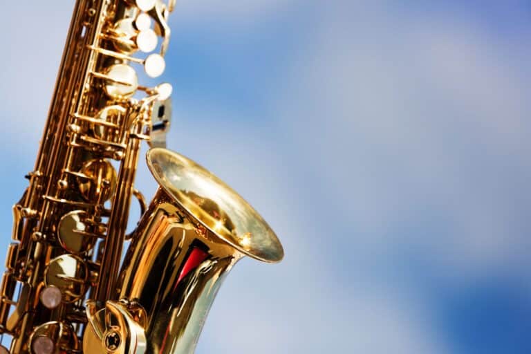
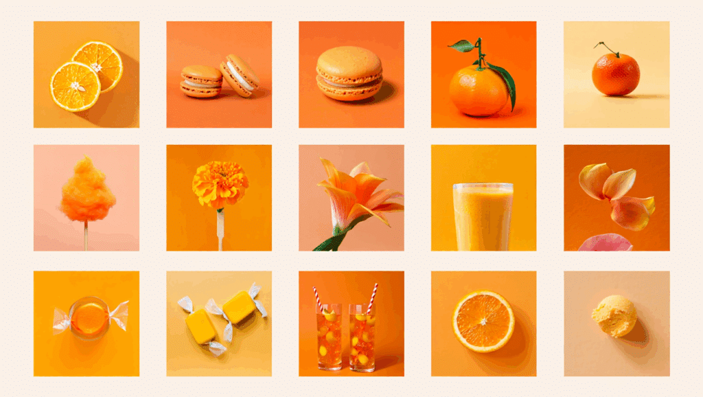
Orange is essentially the extroverted color in the world. It screams enthusiasm, creativity, and warmth, think of autumn leaves, cozy campfires, and citrus bursts.
Psychologically, orange stimulates appetite and conversation, which is why so many restaurants use it. It represents a balance of occurrence and spontaneity, as well as comfort and security.
In many cultures, orange symbolizes good fortune and prosperity. However, it can also signal caution or danger when used in safety equipment.
Orange walks the line between being friendly and bold, making it perfect for brands that want to appear approachable yet confident. It’s the color that says “let’s have fun” without being too serious.
Psychological Impact of Orange on Human Emotion
Orange hits our brains like a shot of espresso. It’s one of the most emotionally stimulating colors, instantly boosting mood and energy levels.
Scientists have found that orange activates the same neural pathways as physical warmth, which explains why we associate it with comfort and happiness. The color also triggers appetite and social behavior.
Restaurants use orange because it makes people feel hungry and chatty. But there’s a flip side: too much orange can feel overwhelming or even aggressive, which is why it’s often used sparingly in interior design.
Additional Psychological Effects:
- Enhances focus and concentration during creative tasks
- Reduces feelings of depression and seasonal sadness
- Increases feelings of playfulness and spontaneity
- Can trigger anxiety in sensitive individuals when overused
- Promotes risk-taking behavior and bold decision-making
- Helps with emotional recovery after trauma or stress
Notable Uses of Orange in Art and Media
Why does the color orange appear so often in powerful artworks and eye-catching media? Orange color is so notable as:
| Category | Use of Orange | Examples |
|---|---|---|
| Art & Emotion | Expresses warmth, intensity, and psychological depth | Van Gogh’s Sunflowers, Matisse’s The Red Studio, Rothko’s Orange, Red, Yellow |
| Film & Visuals | Adds contrast, drama, and emotional tone | Mad Max: Fury Road, Her, The Fifth Element |
| Advertising & Branding | Commands attention without aggression; evokes fun or energy | Fanta, Nickelodeon, Home Depot, Amazon |
| Seasonal & Cultural | Represents harvest, spirituality, celebration, and luck | Halloween, Diwali, Chinese New Year |
| Pop Culture & Media | Conveys friendliness, clarity, and excitement in characters and interfaces | Garfield, Michelangelo, Portal, Phoenix Suns |
| Psychological Effects | Stimulates energy, friendliness and urgency; contrasts well with blue | Used in design for high impact and visibility |
Orange Colour in Design: Applications and Implications
The color orange influences design choices and shapes the way we experience spaces, brands, and visuals:
- Website Call-to-Action Buttons: Orange grabs attention and encourages clicks, making it an ideal choice for “Buy Now” or “Sign Up” buttons.
- Restaurant Branding and Interiors: The color stimulates appetite and social interaction, which is why many food brands use orange.
- Children’s Products and Toys: Orange is a playful and energetic color, naturally appealing to kids and parents alike.
- Warning Signs and Safety Equipment: These demands immediate attention, making them essential for construction zones and emergency gear.
- Accent Color Strategy: Works brilliantly as an accent color, but can overwhelm when used as a dominant shade in designs.
- Visual Hierarchy Creation: Naturally draws the eye first, making it powerful for creating focal points in layouts.
Lesser-Known Facts About Orange
Surprising secrets and uncommon uses that make the color orange more fascinating than it first appears:
1. Orange Didn’t Have a Name Until the Fruit Arrived: Before oranges came to Europe, people called this color “red-yellow” or “saffron.” The color was nameless for centuries.
2. It’s the Hardest Color for Colorblind People to See: Orange poses the biggest challenge for people with red-green colorblindness because it contains both problematic wavelengths.
3. Orange Light Helps You Sleep Better: Unlike blue light, orange light doesn’t suppress melatonin production, which is why sunset-colored bulbs are becoming popular for bedrooms.
4. Prisoners Used to Wear Orange to Prevent Escapes: The bright color made escapees easier to spot in natural environments, though many facilities now use different colors.
5. Orange is the Most Appetite-Stimulating Color: Studies show orange increases hunger more than any other color, which explains why fast-food chains love it.
6. Buddhist Monks’ Robes Aren’t Orange: Traditional robes are saffron-colored, which is more yellow-orange, and the shade varies by region and sect.
7. Orange Improves Athletic Performance: Research suggests athletes perform better when surrounded by orange because it increases energy and confidence levels.
8. It’s the Rarest Color in National Flags: Only about 10% of world flags contain orange, making it one of the least common flag colors globally.
9. Orange Was the First Color TV Test Pattern: Early color television used orange because it was easiest for broadcast equipment to reproduce accurately.
10. Orange Streetlights Reduce Crime: Some cities use orange sodium lights because they improve visibility and create a warmer, safer-feeling environment.
The Bottom Line
Orange isn’t just a color, it’s a mood, a message, and sometimes a complete game-changer.
Understanding the orange color meaning helps you make smarter choices. The beauty of orange lies in its versatility.
It can be playful yet professional, warm yet energizing, attention-grabbing yet surprisingly comforting. And now that you know its psychological tricks and cultural significance, you can use orange with confidence.
How has learning about orange color meaning changed your perspective? Share your thoughts in the comments below.