White ceilings. Neutral trim. Safe beige walls. Sound familiar? That design playbook works, but it plays it safe.
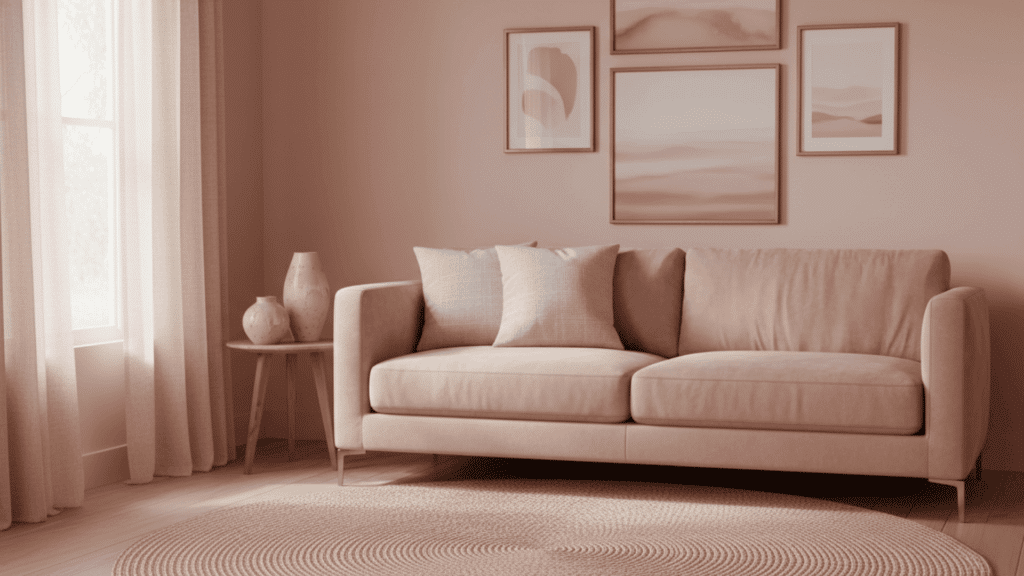
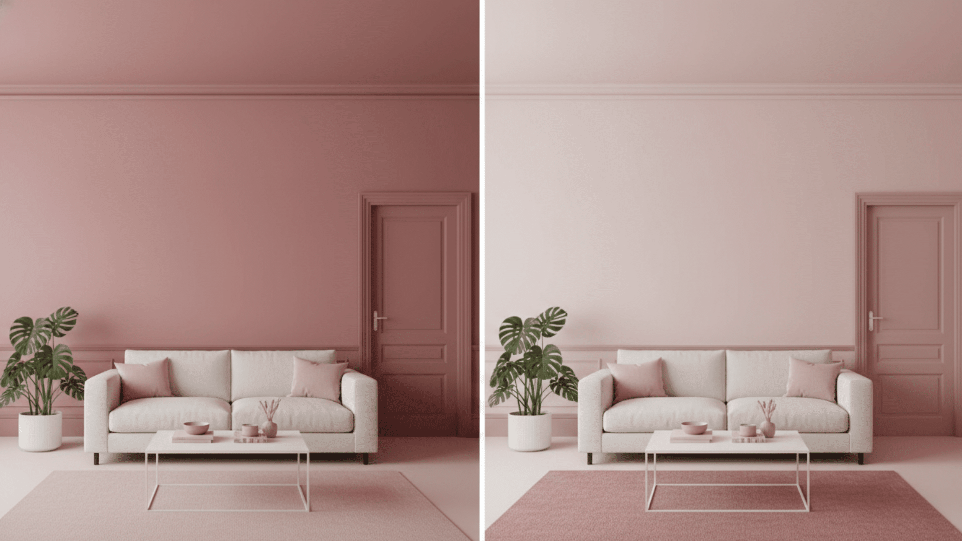
Enter the color-drenched room, a bold technique where one hue covers everything from the ceiling to the baseboards. No breaks. No safe zones. Just pure, immersive color.
This approach has exploded from designer showrooms into real homes, and for good reason. It creates mood, defines space, and makes a statement without adding a single piece of furniture.
In this guide, you’ll learn what makes a room truly color-drenched, how it differs from monochromatic design, step-by-step application techniques, room-specific strategies, and expert tips to pull it off without regrets.
What Is a Color Drenched Room?
A color-drenched room is an interior design technique where you paint everything in one single hue. This includes walls, ceilings, trim, and often furniture too.
Unlike traditional painting that uses white ceilings and neutral trim, or accent walls that highlight just one surface, this approach wraps the entire space in color.
The trend has roots in European design from the 1960s and 70s. It recently gained momentum through social media and designer showcases.
Today, it has moved from niche luxury homes into mainstream residential design. The result creates an immersive, cohesive look that feels both bold and surprisingly calming.
Color Drenching vs. Monochromatic Design
Many people confuse color drenching with monochromatic design, but they are not the same thing. Understanding the difference helps you choose the right approach for your space.
| Aspect | Color Drenching | Monochromatic Design |
|---|---|---|
| Color Application | One exact hue on all surfaces | Multiple shades of one color family |
| Walls | Same color throughout | Can vary in lightness or darkness |
| Ceiling & Trim | Painted the same exact color | Often different shades of white |
| Furniture | Often matches the wall color | Uses varied tones for contrast |
| Visual Effect | Bold, immersive, statement-making | Subtle, layered, dimensional |
| Best For | Creating drama and cohesion | Adding depth while staying safe |
| Design Skill Level | Requires confidence with color | Easier for beginners |
| When to Use | Small spaces, feature rooms, bold statements | Any room size, timeless appeal |
Monochromatic design uses one color family but plays with different shades, tints, and tones. You might see light blue walls, navy furniture, and sky blue accents all in one room.
Color drenching, however, sticks to one exact hue across every surface. Everything gets the same shade of pain.
How to Drench a Room: Step by Step
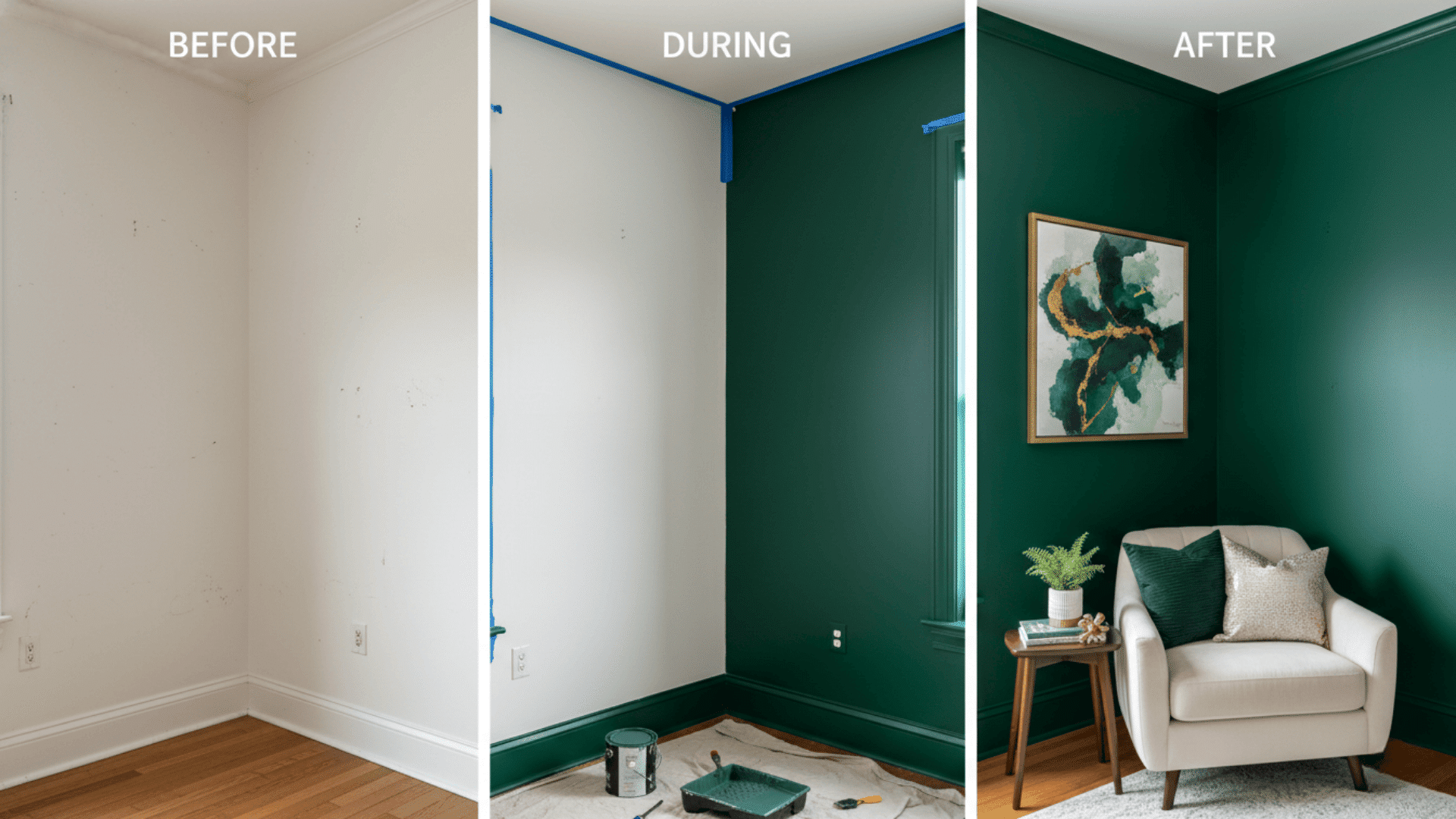
Creating a color-drenched room sounds complex, but it breaks down into simple steps. Follow this process to achieve a professional finish that changes your space completely.
Step 1: Prepare the Space
Clean your walls thoroughly to remove dust, grease, and dirt. Fill any holes or cracks with spackling compound and sand them smooth.
Use painter’s tape to protect fixtures, windows, and flooring. Proper prep work makes the difference between a clean finish and a messy result.
Step 2: Choose Your Paint
Select the right paint finish for each surface in your room. Matte or flat paint works well for ceilings and hides imperfections. Satin or eggshell finishes suit walls because they are easy to clean.
Use semi-gloss or gloss paint on trim, doors, and moldings for durability and subtle contrast.
Step 3: Select the Right Tools
Gather quality brushes for cutting in around edges and corners. Get roller covers in different nap sizes based on your wall texture.
Buy painter’s tape that releases cleanly without damaging surfaces. Use an extension pole for reaching ceilings without a ladder. Good tools save time and produce better results.
Step 4: Apply Your Color
Start painting the ceiling first to avoid drips on finished walls. Move to the walls next, using a brush for edges and a roller for large areas.
Paint the trim, doors, and moldings last for the cleanest lines. Apply two coats for even coverage and true color depth.
Step 5: Layer Textures
Add varied textures to prevent your room from looking flat or one-dimensional. Bring in linen curtains, velvet pillows, or woven rugs in the same color family.
Include wood furniture, metal accents, or glass pieces for visual interest. Texture creates depth even when everything shares the same hue.
Room-By-Room Guide to Color Drenching
Each room in your home serves a different purpose and requires thoughtful color selection. Let me walk you through how to apply the color-drenched room technique in every space for maximum impact.
1. Bedrooms
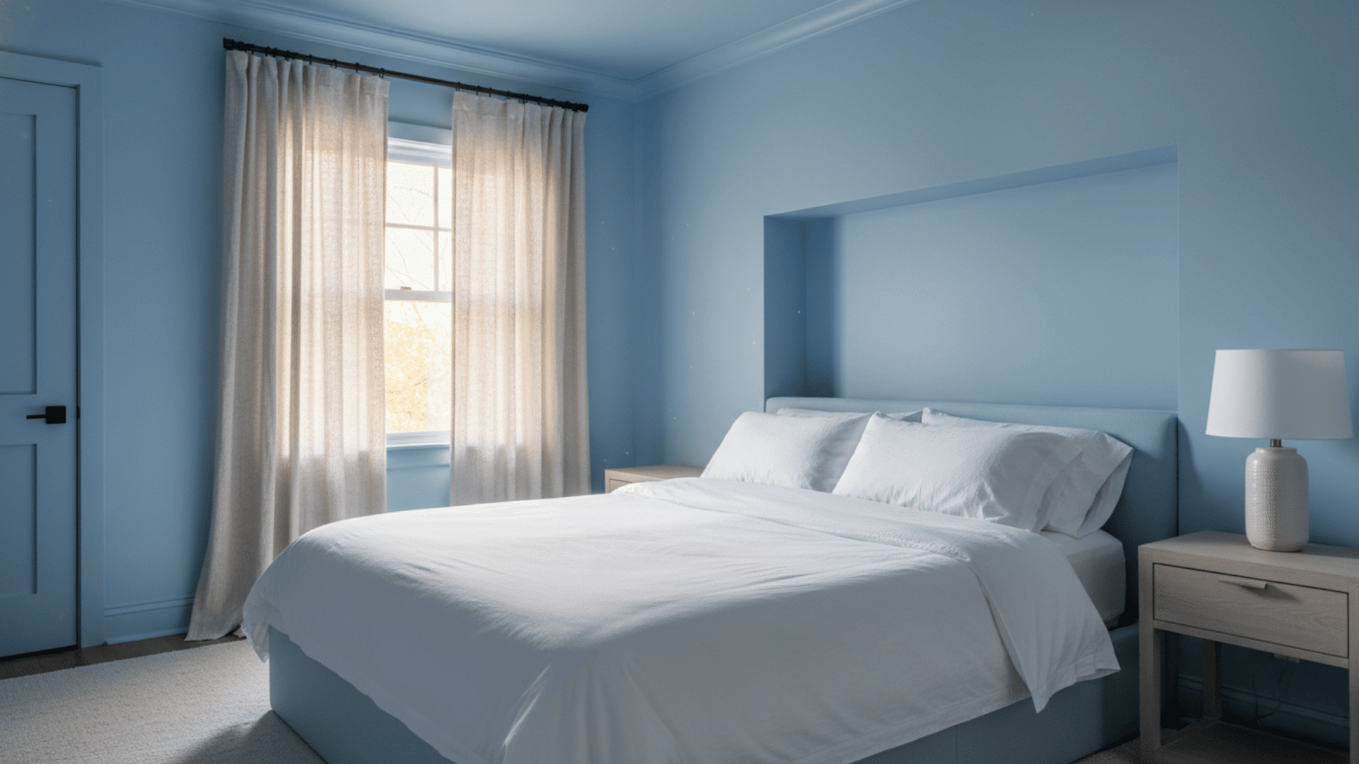
Your bedroom should feel like a personal retreat from the world. A color-drenched room approach works perfectly here because it wraps you in comfort.
Soft hues like blush pink, powder blue, or sage green create calm atmospheres ideal for sleep. Bold tones like deep plum or charcoal add drama and sophistication for those who want a moody sanctuary.
- Best Colors: Soft blues, muted greens, warm grays, dusty rose, deep navy
- Avoid: Bright reds or oranges that may disrupt sleep
- Pro Tip: Use different textures in bedding and curtains to add depth without breaking the color scheme.
2. Living Rooms
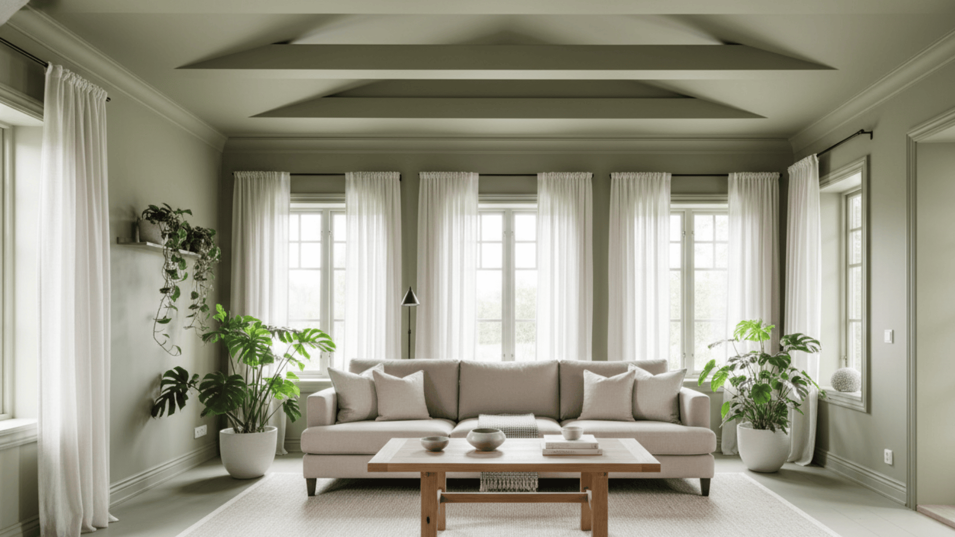
Living rooms benefit from color drenching because it creates visual unity in multipurpose spaces. Consider how much natural light enters the room before choosing your shade.
Light colors make small living rooms feel larger and airier. Dark colors add coziness to spacious rooms, but need adequate lighting to prevent a cave-like feel.
- Best Colors: Warm neutrals, soft greens, rich browns, muted blues
- Avoid: Colors that clash with your existing furniture
- Pro Tip: Paint built-in shelves and bookcases the same color for a cohesive look.
3. Kitchens & Dining Rooms
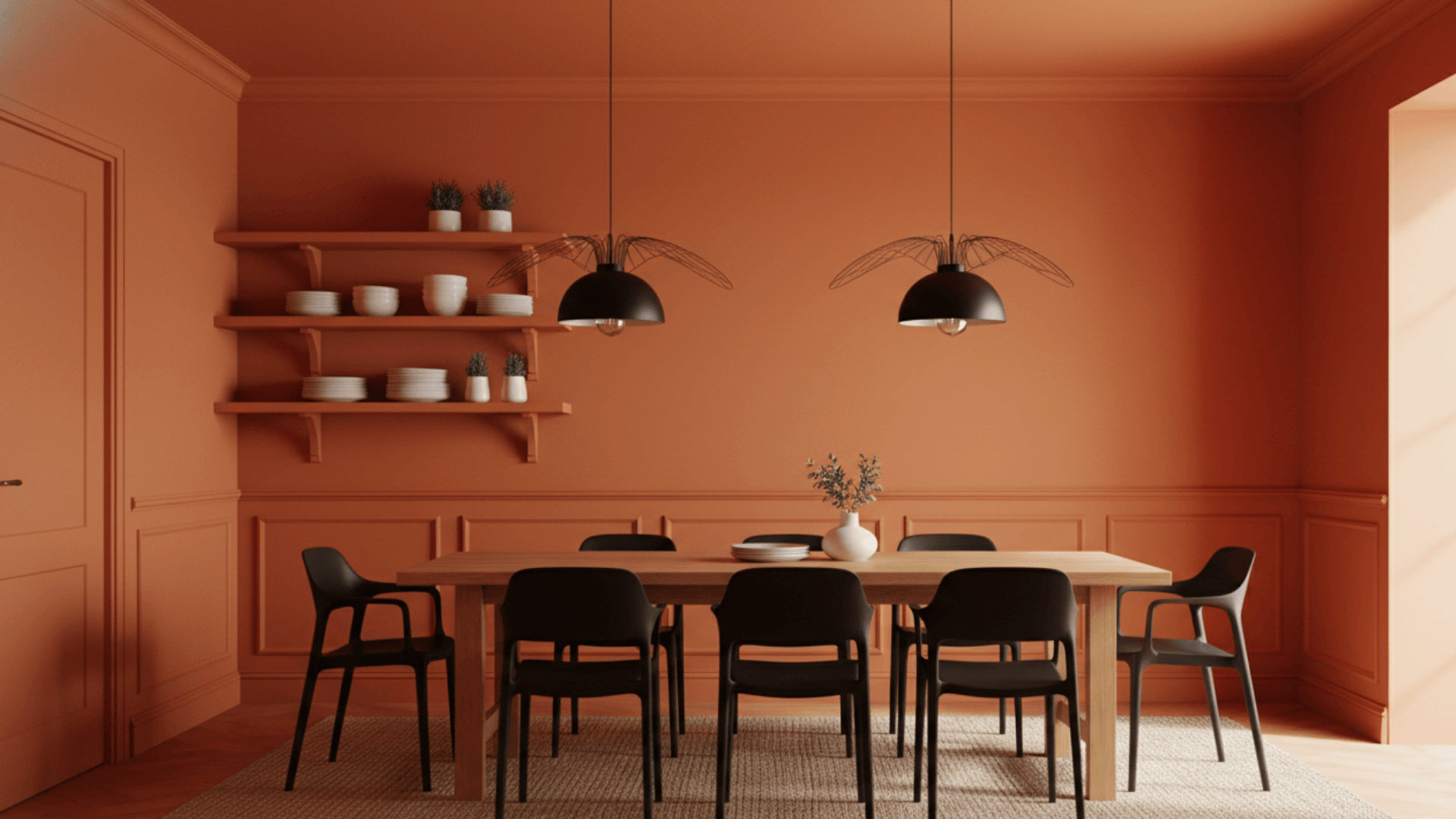
These social spaces thrive with energizing colors that stimulate appetite and conversation. Warm hues like terracotta, coral, or golden yellow create vibrant, welcoming environments perfect for gathering.
The color-drenched room technique in kitchens requires durable paint that withstands moisture and cleaning. Consider how your color choice complements countertops and cabinetry.
- Best Colors: Warm terracotta, sunny yellow, olive green, soft coral
- Avoid: Very dark colors in small kitchens with limited light
- Pro Tip: Extend the color to cabinet interiors for a complete immersive effect.
4. Bathrooms
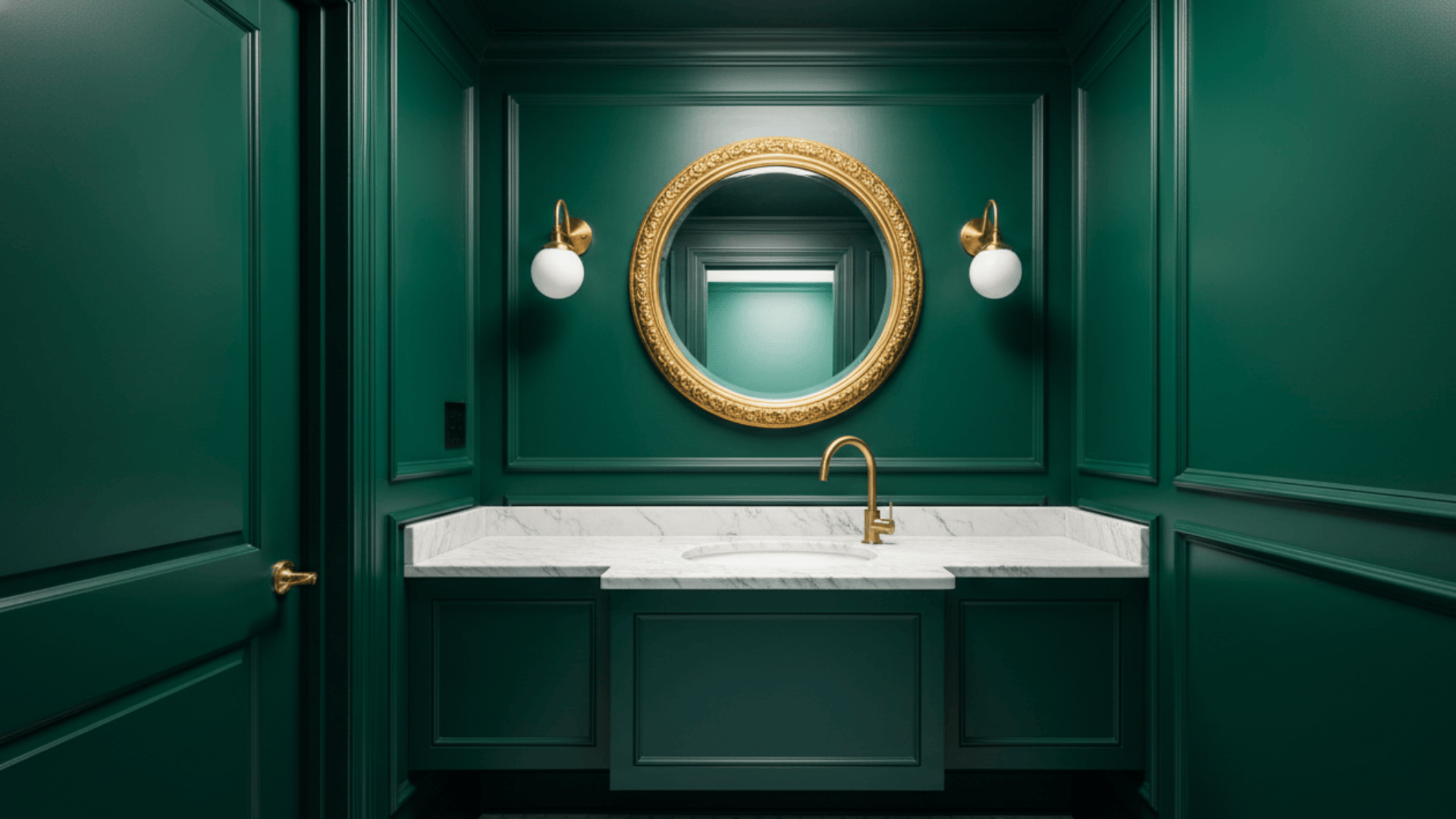
Powder rooms and guest bathrooms offer the perfect opportunity for bold experimentation. These smaller spaces can handle dramatic colors that might overwhelm larger rooms.
A color-drenched room design in bathrooms creates a jewel box effect that feels luxurious and intentional. Rich, saturated colors like emerald, sapphire, or burgundy work beautifully in these intimate spaces.
- Best Colors: Deep greens, rich blues, charcoal, burgundy, black
- Avoid: Colors that make skin tones look unflattering in mirrors
- Pro Tip: Use glossy paint finishes for moisture resistance and light reflection.
5. Home Offices
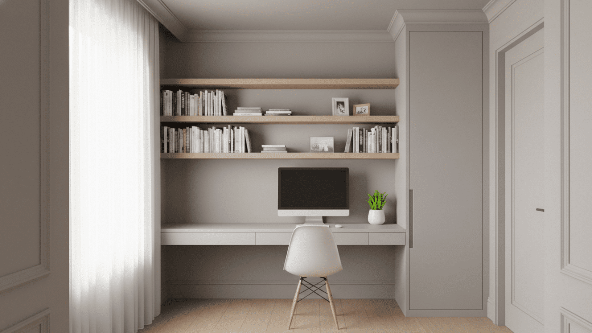
Your workspace needs colors that enhance focus without causing visual fatigue. A color-drenched room in your home office can boost productivity when done right.
Lighter hues like soft gray, pale blue, or warm beige keep the space feeling open and energizing. Avoid overly bright or stimulating colors that may increase stress or distraction during long work hours.
- Best Colors: Soft gray, pale blue, warm beige, muted green, light taupe
- Avoid: Bright yellow, red, or orange that may overstimulate
- Pro Tip: Paint only three walls if the color feels too intense for an all-day workspace.
Pros and Cons of a Color-Drenched Room
Before committing to this design technique, weigh the benefits against potential challenges. Understanding both sides helps you make an informed decision that suits your space and lifestyle.
| Pros | Cons |
|---|---|
| Creates cohesive, unified look | Can be overwhelming in small spaces |
| Enhances mood through color psychology | May feel flat without texture variety |
| Visually adjusts room size perception | Limits future design flexibility |
| Increases intimacy and comfort | Shows wear and dirt more easily |
| Makes a bold, modern statement | Can feel claustrophobic if too dark |
Tips for Successful Color Drenching
Getting a color-drenched room right requires careful planning and smart execution. Follow these expert tips to avoid common mistakes and achieve a polished, professional result.
- Test Before You Commit: Paint large swatches on different walls and observe them throughout the day in various lighting conditions before buying all your paint.
- Use a Matte or Satin Finish: Matte finishes hide imperfections and create depth, while satin reflects light gently to prevent the space from feeling flat or dull.
- Balance with Textures: Add wood furniture, metal fixtures, woven textiles, and varied fabrics to break up visual uniformity and create dimensional interest.
- Don’t Overdo It: Leave some breathing room by introducing neutral or contrasting accessories like rugs, artwork, or furniture to prevent color fatigue.
- Consider Room Size: Use lighter shades to make small rooms feel more spacious and open, while darker colors bring warmth and intimacy to large areas.
How to Choose the Right Hue for a Color-Drenched Room?
Start by thinking about what happens in the room. Bedrooms need soft, calming colors like blue or lavender for rest. Living rooms can handle vibrant tones like coral or green for energy.
Check how much natural light enters the space throughout the day. Colors look different in morning sun versus evening light, so test samples at various times.
Use color psychology to guide your choice. Blues promote relaxation, yellows spark creativity, and reds add drama. Finally, make sure your chosen hue works with existing furniture and decor.
A color-drenched room should feel intentional, not like you are fighting against what you already own.
Final Thoughts
A color-drenched room changes ordinary spaces into bold, cohesive statements that reflect your personality.
This technique goes beyond paint; it creates atmosphere, influences mood, and redefines how we experience interior design. Start small if you’re nervous.
Try a powder room or home office before tackling your living room. Remember to test colors in different lighting, layer textures for depth, and trust your instincts.
The beauty of this approach is that it’s reversible. Paint can always change. But the confidence and style you gain? That stays with you.
Ready to make your move? Grab some paint samples this weekend and see which color speaks to your space. Share your results in the comments below. We’d love to see your conversion!